
SMC Library Posters
Poster mockups: These show what the physical and digital poster designs would look in real life.

Context/Brief
The SMC library's primary goal is to promote student success by serving students' information and research needs.
User Experience Design 2 / Fall 2023_Reimagining the SMC Library Experience
I was part of the marketing team for the SMC Library. My group had one question we needed to answer: "What are ways to raise awareness about library resources and services for students and faculty?"
Students were this assignment's primary audience, and we had to try to understand their pain points when visiting the library and what may make them excited.
Some examples of student opportunities we could promote included e-resources (streaming video collections, ebooks), study rooms, technology access (Chromebooks, scanners), and library workshops and events.
There were also several constraints on the project we had to acknowledge:
•The library's limited staff
•Limited tech support
•The need for a content moderation process
•A limited budget
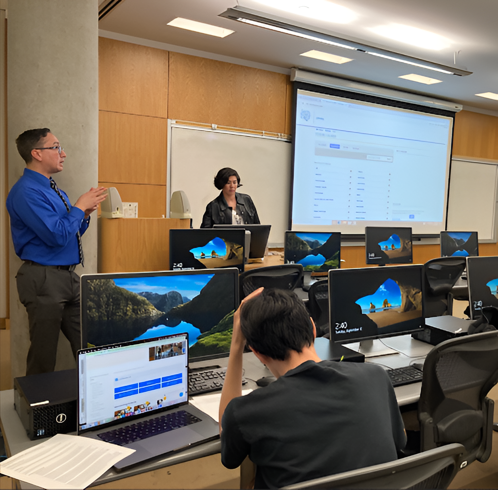
Stakeholder kickoff meeting on September 12th.
Visual Assets
Santa Monica College Logo:
Sample Colors:
The sample color and sample typefaces come from the SMC Brand Style and Logo Guidelines page of the SMC website.
Sample Typefaces:
My Role in the Project
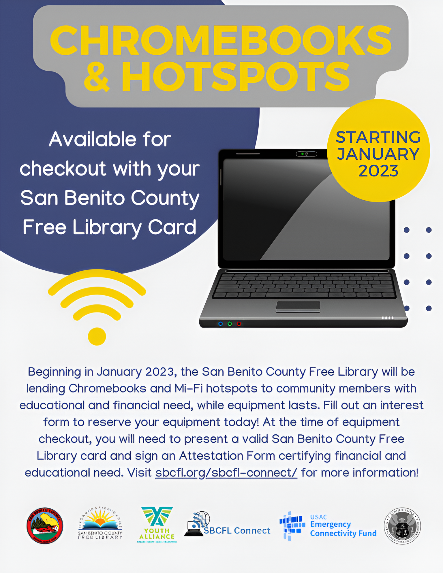
Graphic designer, interviewer, and design researcher. Created posters informing students about the SMC library’s Chromebook borrowing program and met with stakeholders.
My Design Partners:
Yuanxi Li: Graphic designer. Li created another set of posters informing students about workshops and events offered by the SMC library.
Kelly Lee: Social media designer and interviewer. Lee created an Instagram account.
Who was the client, what was the brief?
Client:
Santa Monica College Library. (Academic Project)
Brief:
Create deliverables that spread awareness of the SMC Library’s resources and services among students and faculty.
Project Overview
Problem:
The Chromebook borrowing program is a valuable service for SMC students but barely had any marketing. As a result, most students seemed unaware of the program’s existence despite how much it could help them.
Insight:
An insight I gained from my research was that many students had little knowledge of the SMC library. I learned from conducting interviews that some students had never visited the library and did not feel the need to go there. Many students rarely visited the campus because classes had been online for two years during the COVID-19 pandemic.
Solution:
I created a digital poster in addition to a physical one. This digital poster could be sent to online students via a mass email. Both posters communicated the necessary information about the Chromebook borrowing program. The posters were designed to appeal to students physically present on campus and those online.
Process
I searched for inspiration, conducted student interviews, created a customer journey map, brainstormed sketches, made low-fidelity and mid-fidelity prototypes, consulted with stakeholders, made high-fidelity prototypes, and then used feedback from stakeholders and my professor to create final poster designs.
Inspiration:
A poster advertising a Chromebook borrowing program served as my primary inspiration.
Student Interview:
"I don't need the SMC Library, so I don't really research it...I was online for most of two years, so there was no need for me to visit the campus or anything like that."
-Angy, an SMC student majoring in Interior Design.
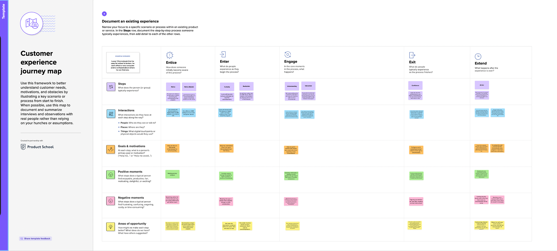
Customer Journey Map:
My Customer Journey Experience Map helped me plan how I wanted users to interact with my posters.
Low-fidelity sketches:
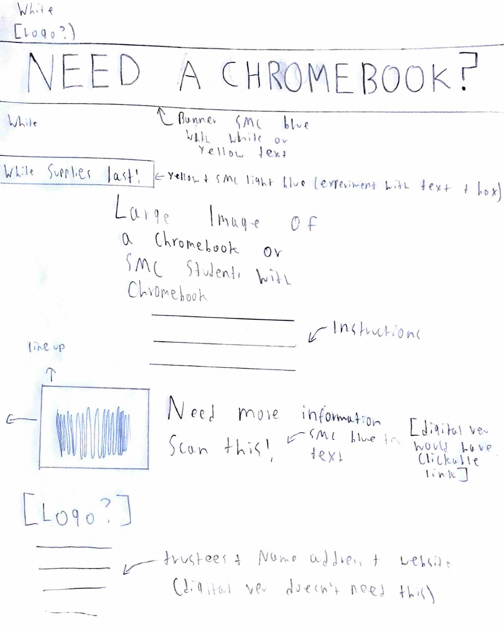
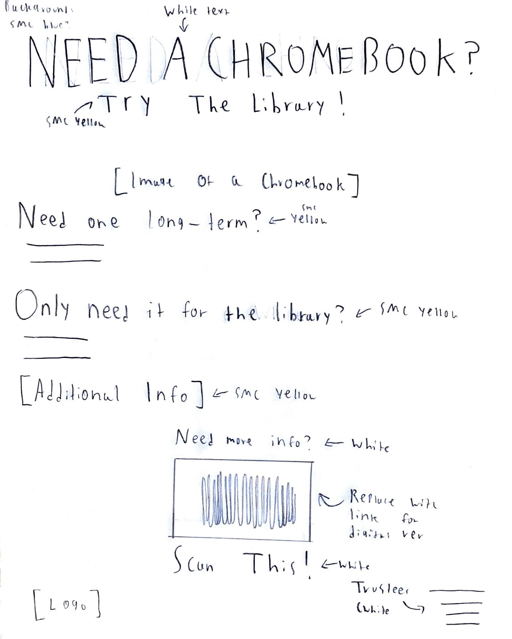
Three low-fidelity sketches for potential arrangements of information.

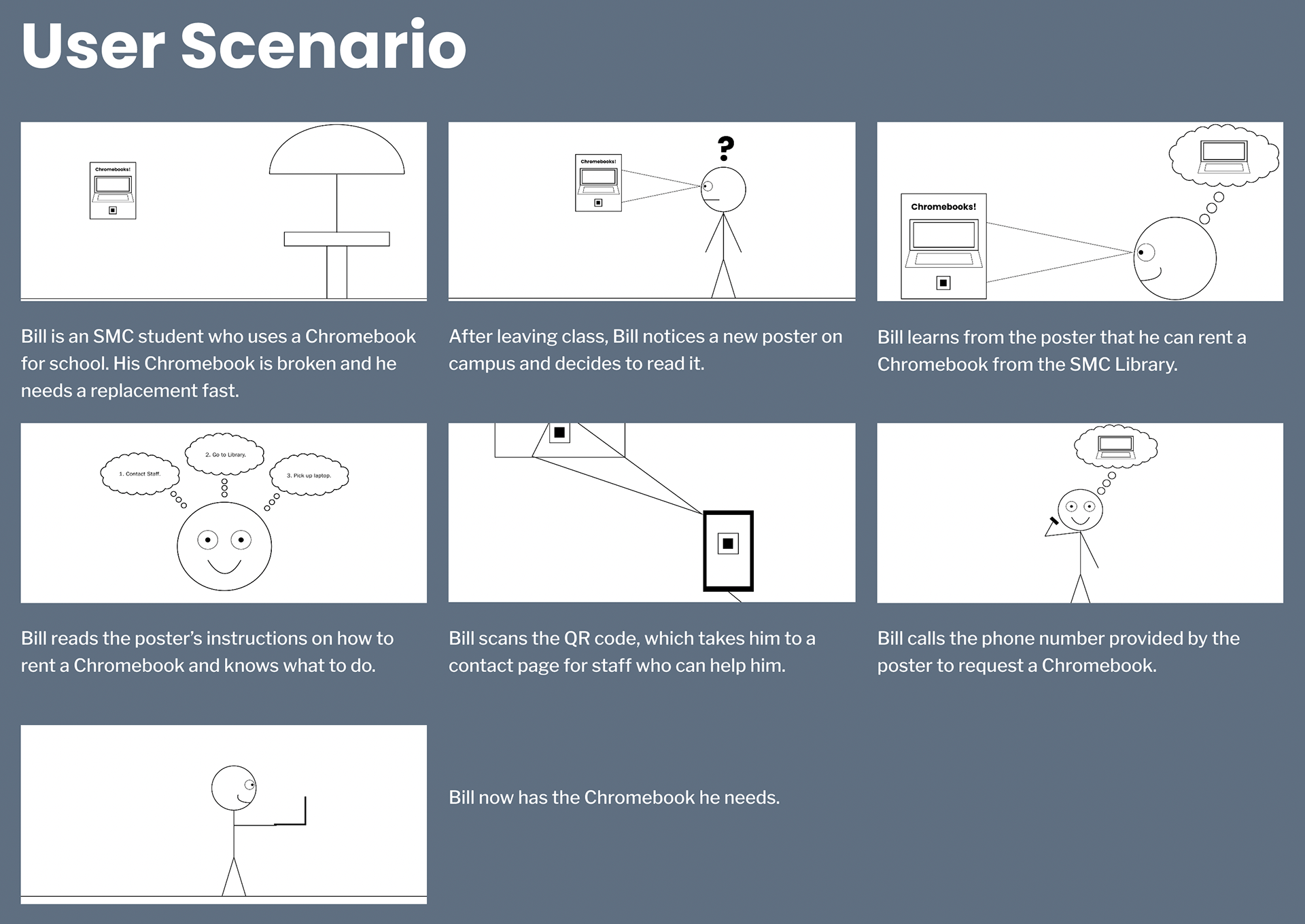
User Scenario:
The ideal way for users to interact with my designs.
Staff Contact Sheet:
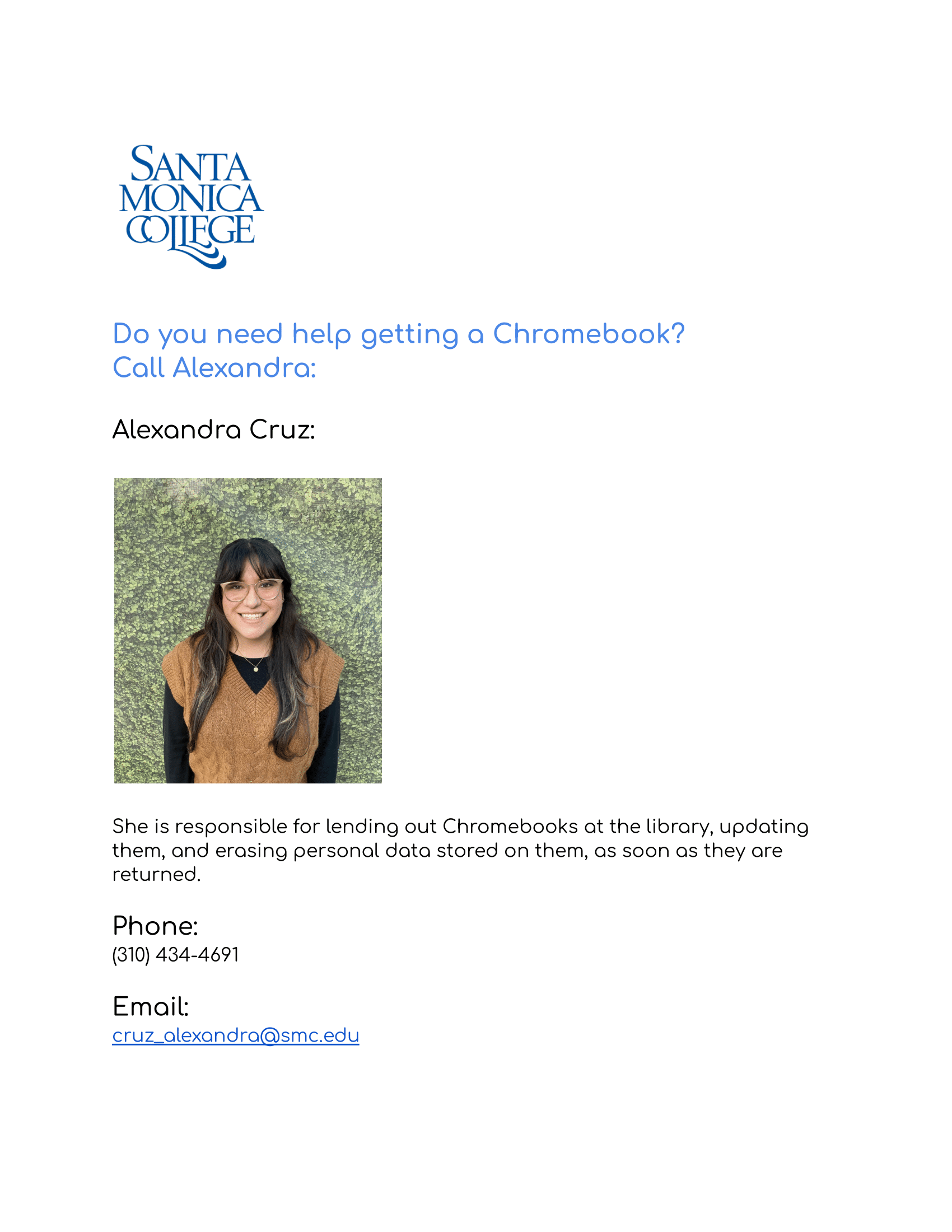
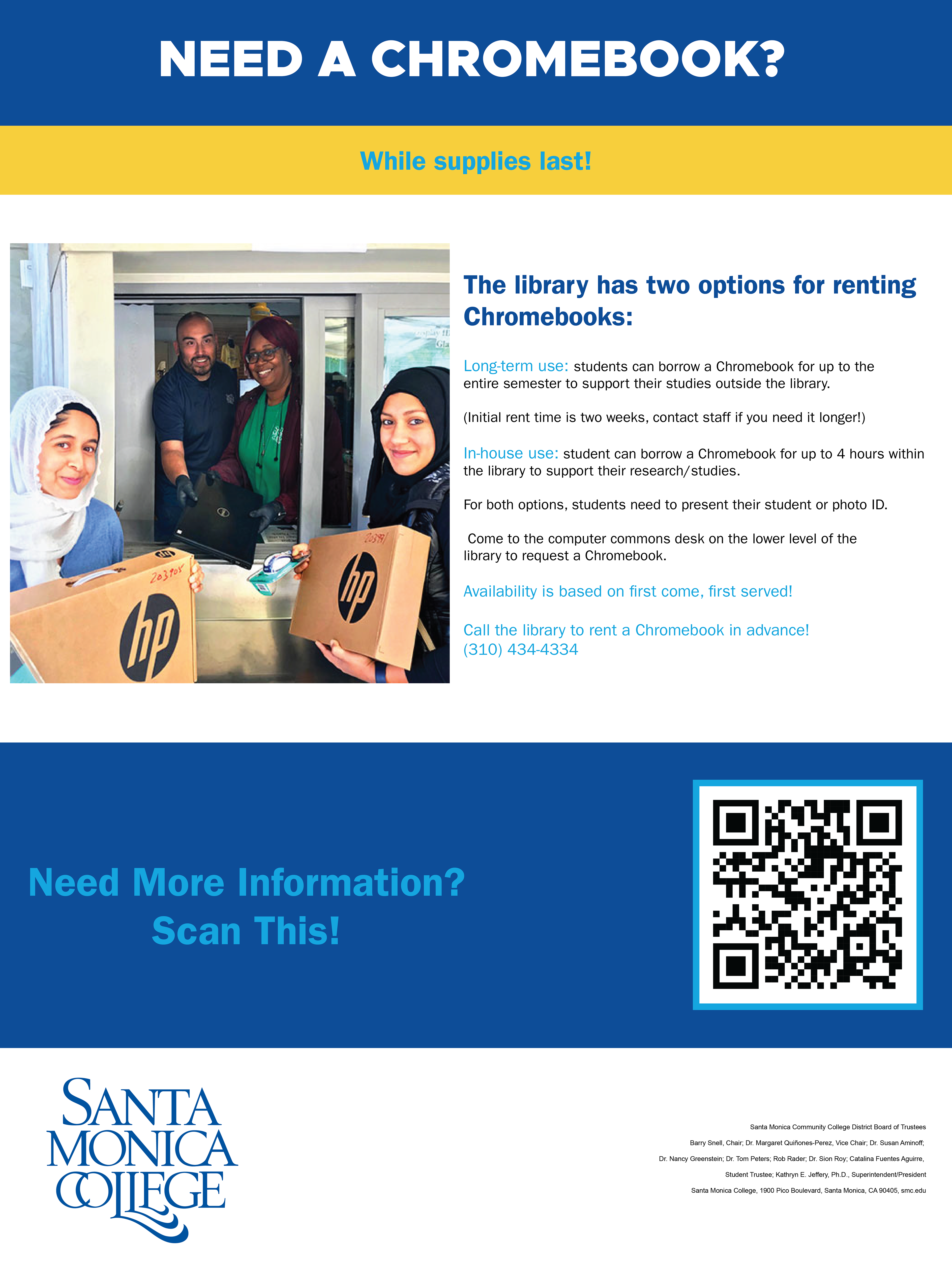
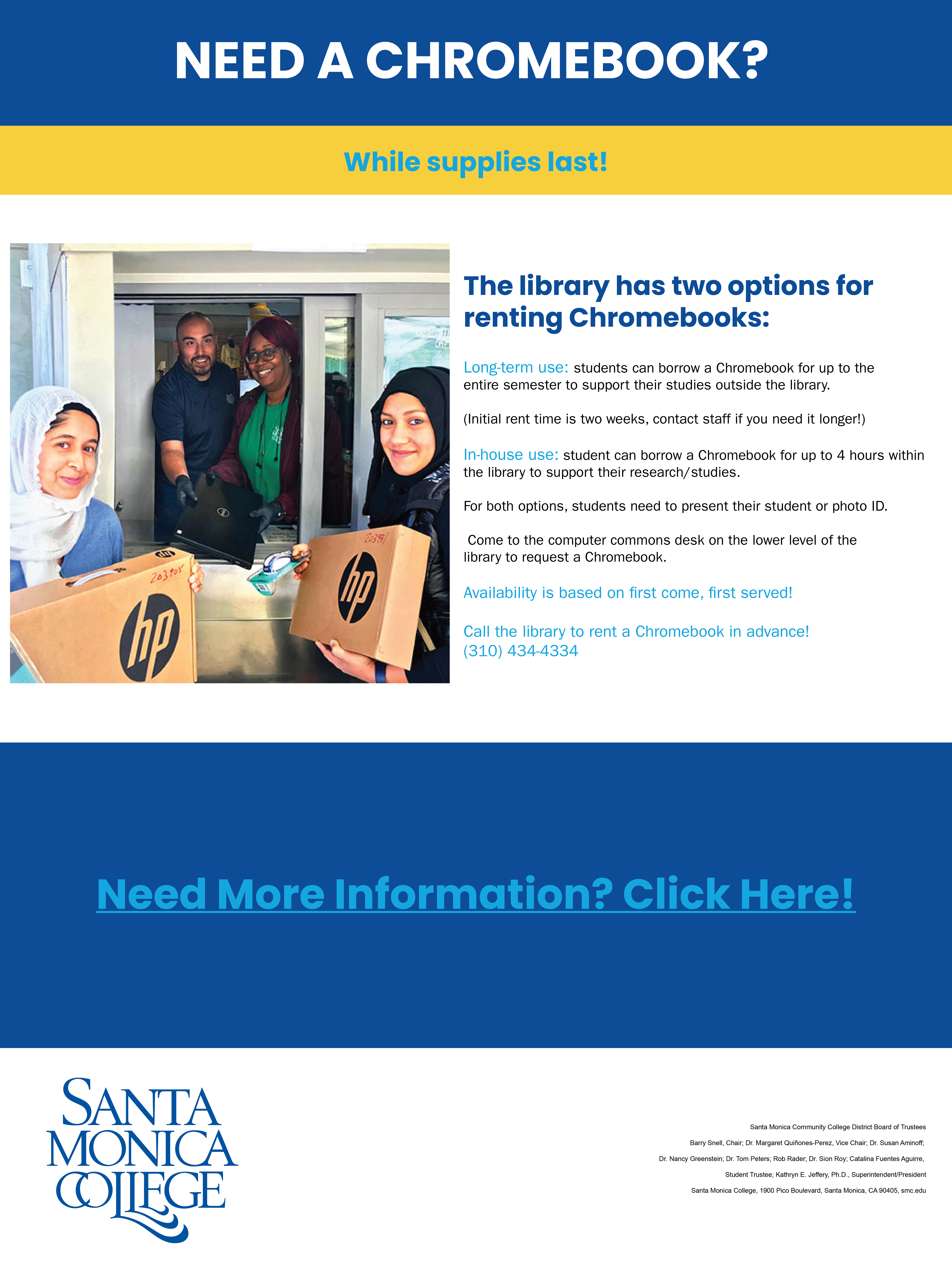
The posters contained links to this staff contact sheet. This sheet gave contact information for staff involved with the Chromebook borrowing program and would be accessible via a QR Code or clickable link.

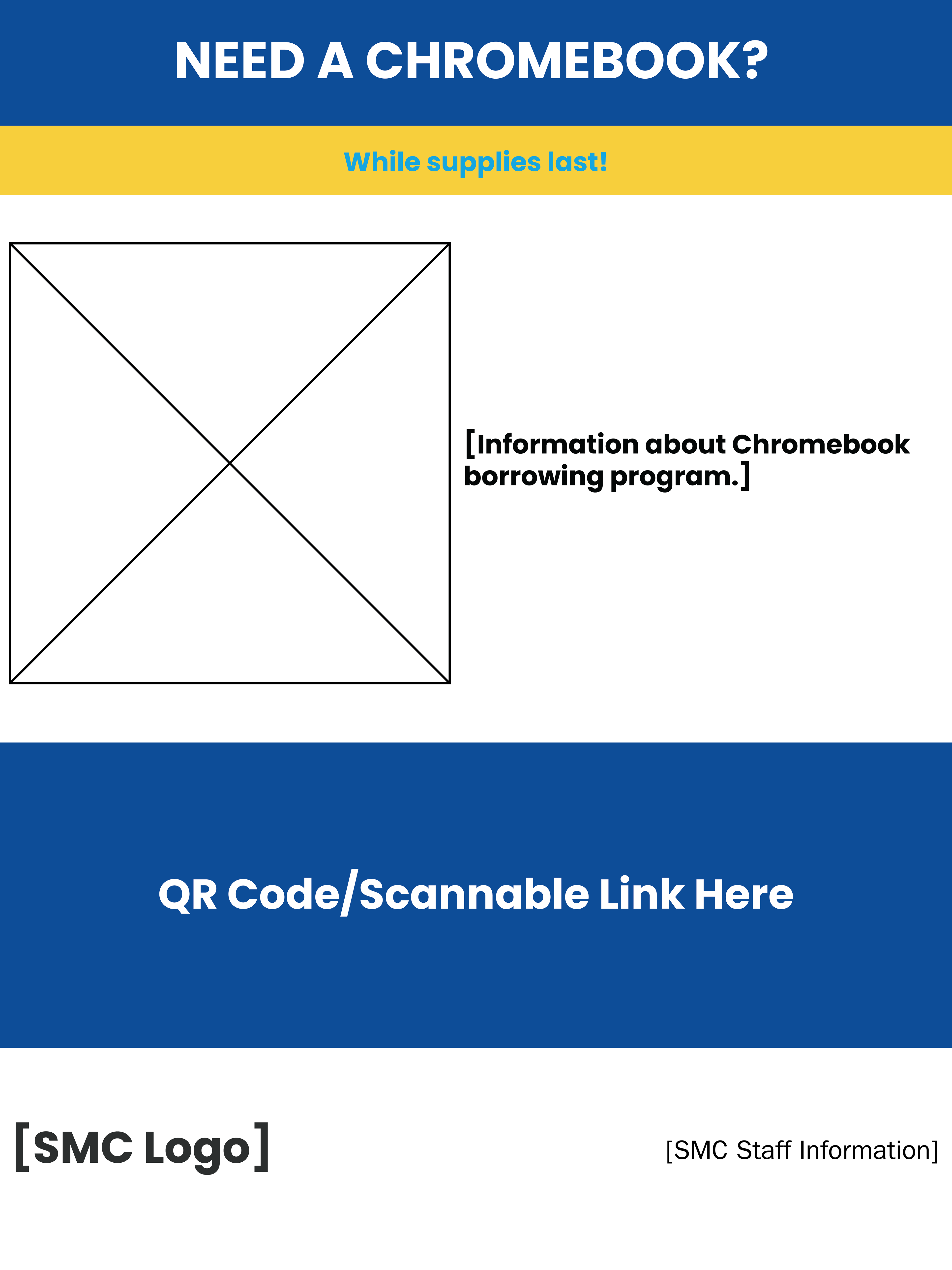
Digital Wireframe:
Mid-fidelity digital wireframe for the posters.
Initial Illustrator Layout:
Initial physical and digital designs for posters with a QR Code and a Clickable Link.
Initial physical and digital designs for posters with a QR Code and a Clickable Link.
Alternative Illustrator Designs:
Physical poster prototype where I experimented with incorporating the image of a Chromebook into the design.
Digital poster prototype where I experimented with incorporating the image of a Chromebook into the design.
Digital poster prototype with an alternative Chromebook image.
Further Imagery Experimentation:
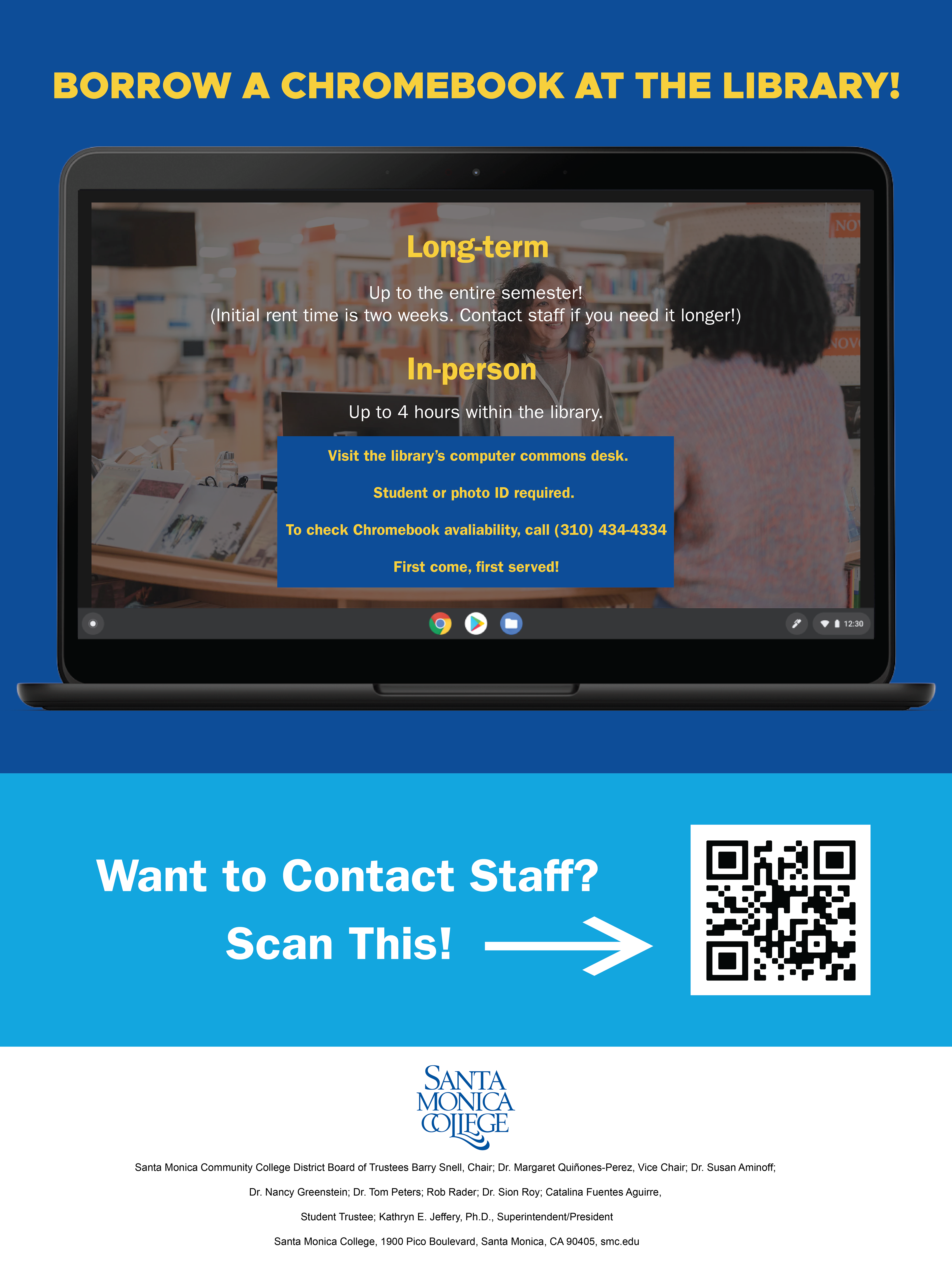
My first attempt at creating a uniform layout for the physical and digital posters. This poster incorporated imagery of a Chromebook against a blue background and added resources for additional information.
Experimentation with images of libraries without Chromebooks:
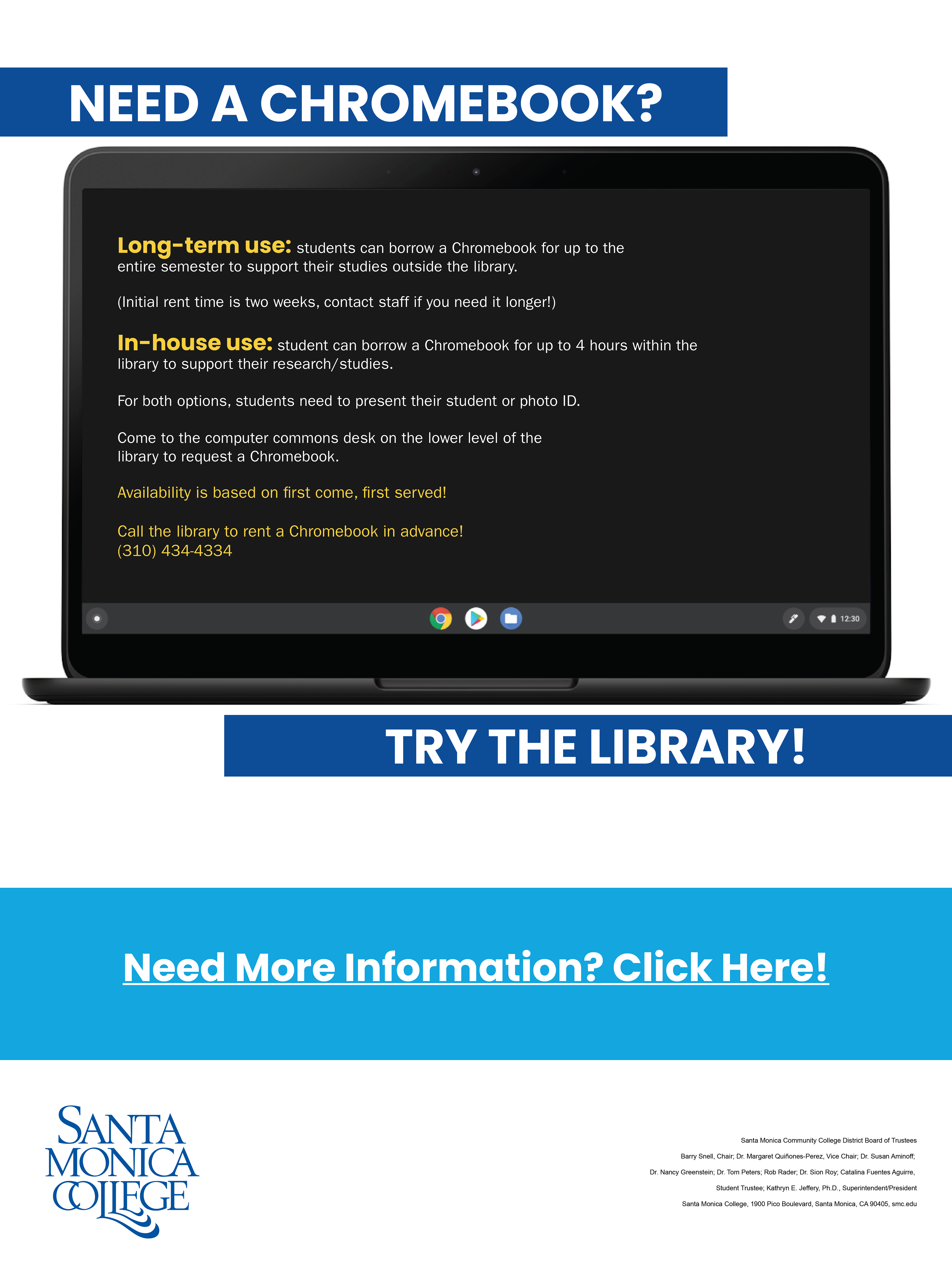
Digital and Physical Poster layouts without the image of Chromebook. Other changes include placing instructions in a yellow box and relevant staff in the bottom center of the poster.

Physical poster: Experimented with making the arrow pointing to the QR code larger and placing the SMC logo at the bottom left.

Digital poster: Experimented with making the header larger, increasing information in the yellow box, moving the clickable link to the bottom right, moving the SMC logo to the bottom left, increasing its size, and putting information closer together.
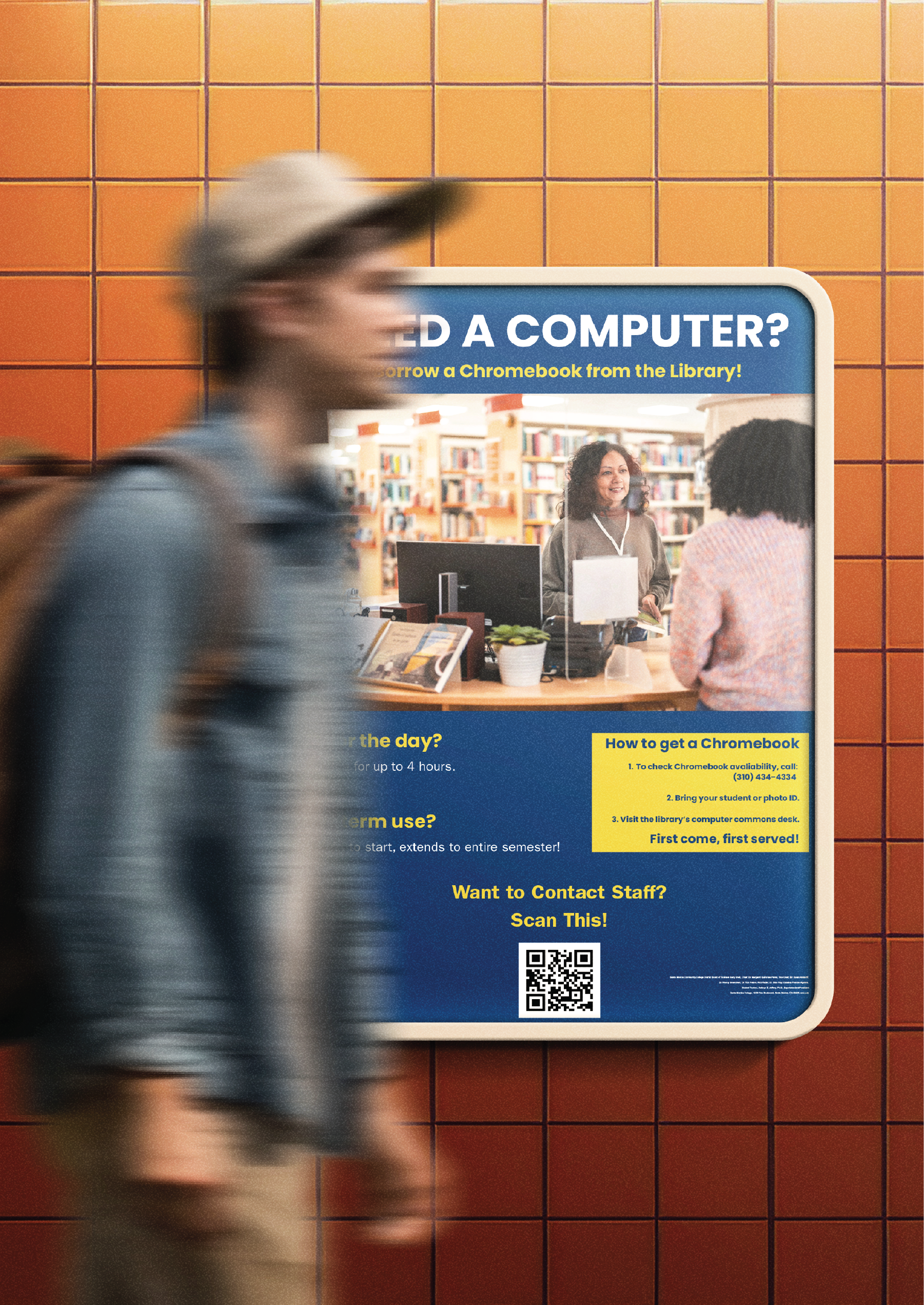
Final Iteration:

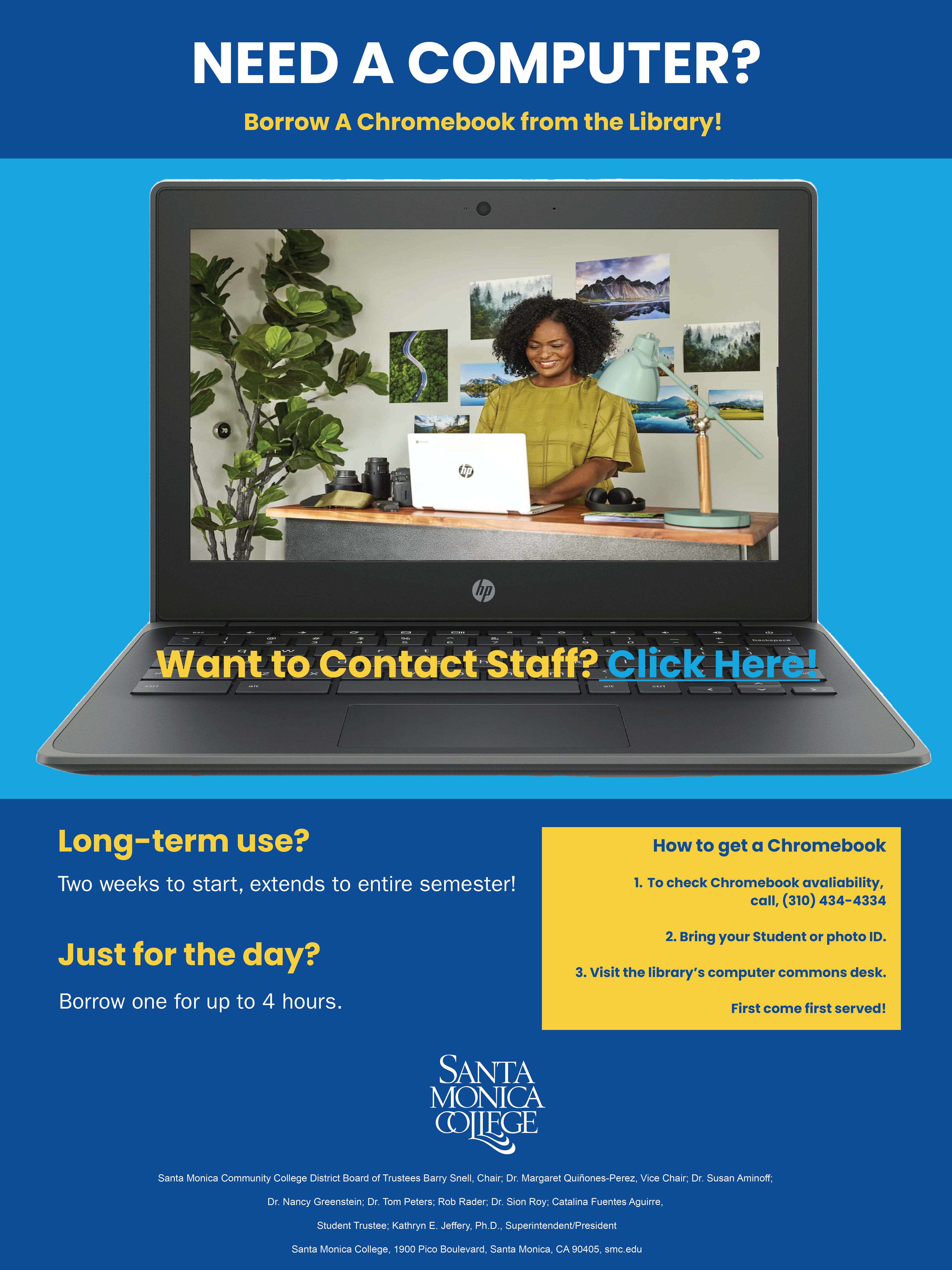
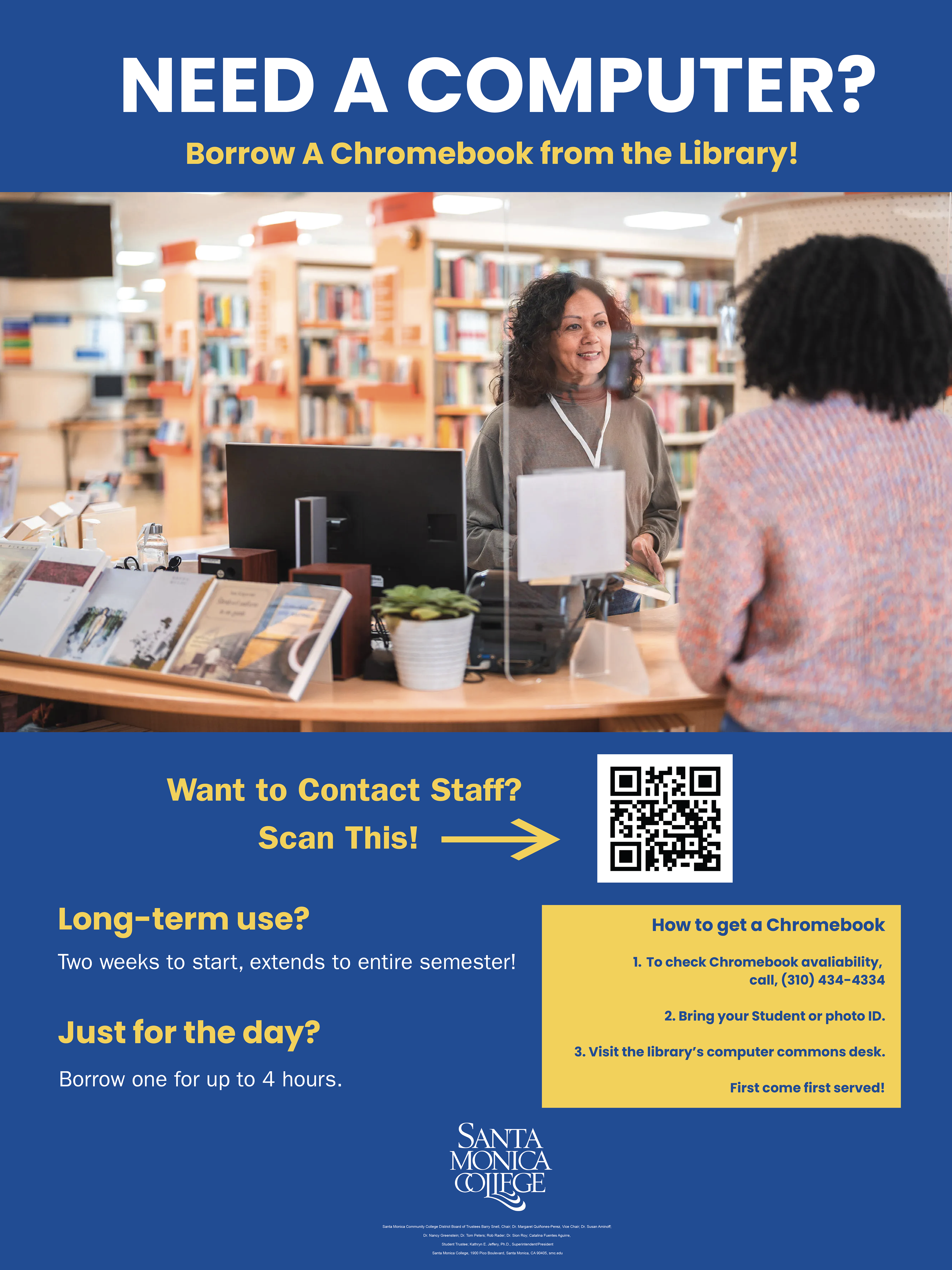
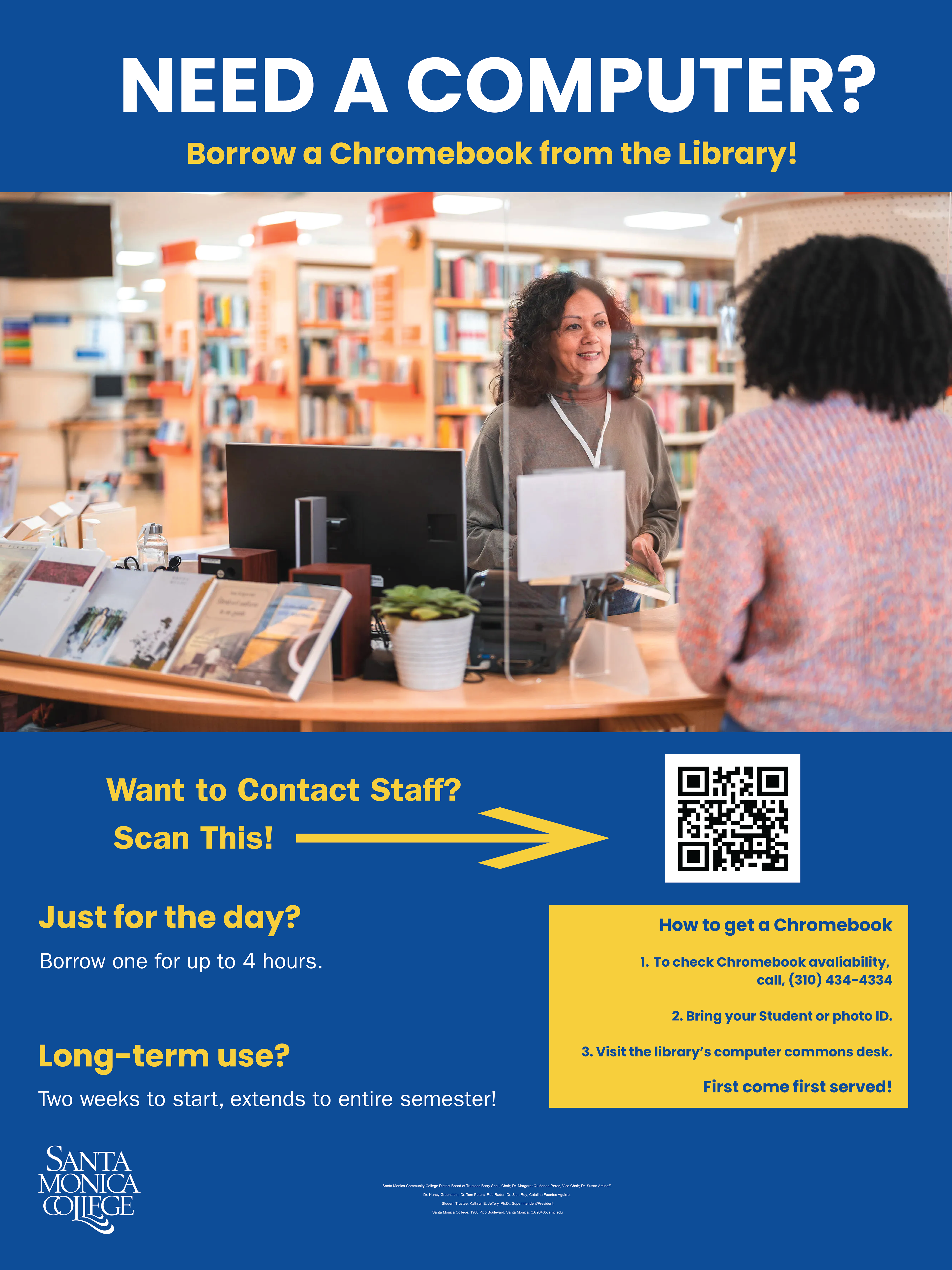
Final Physical Poster Design: Moved relevant staff to the bottom right, placed the QR code near the bottom, and removed the arrow.

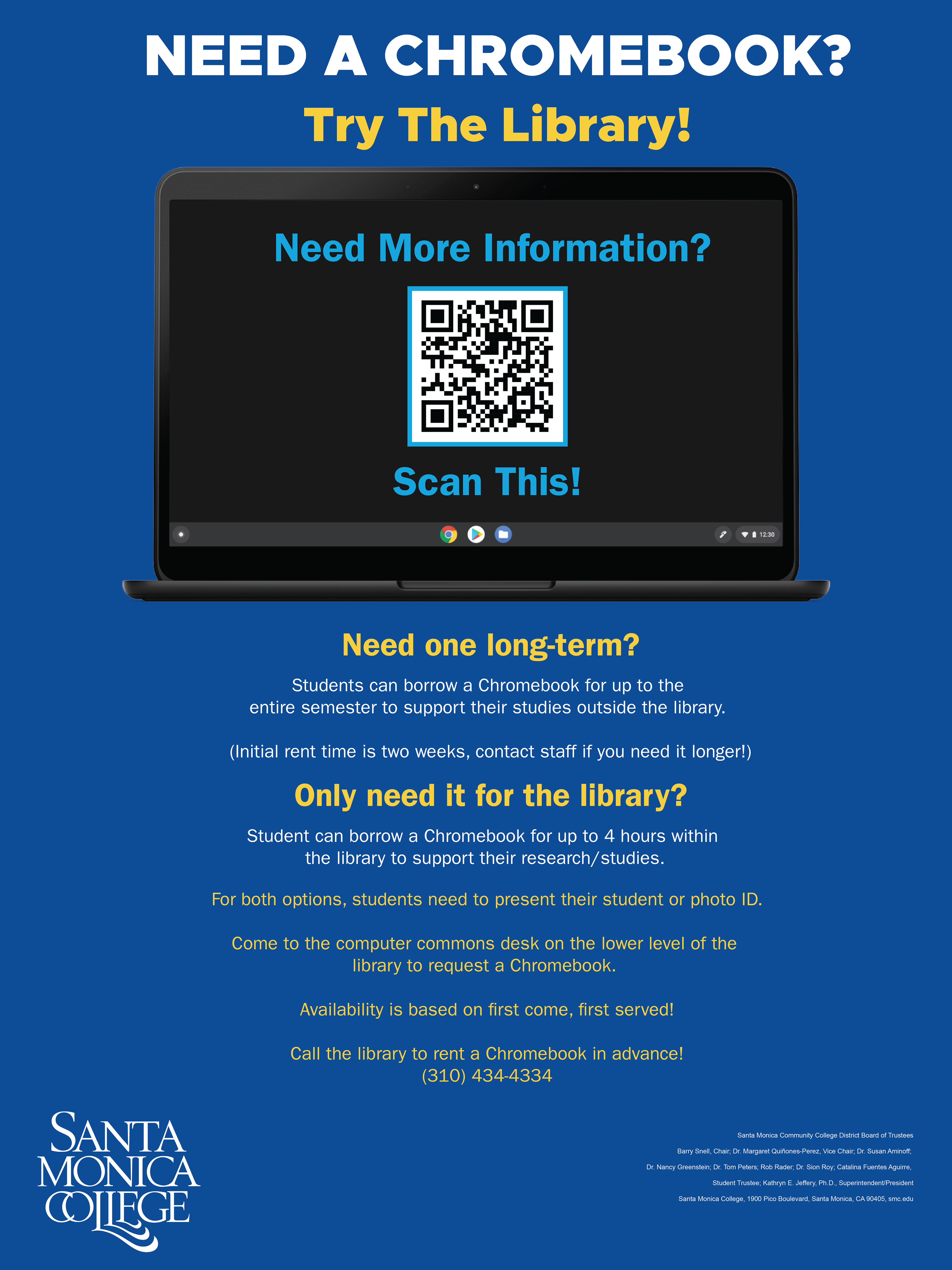
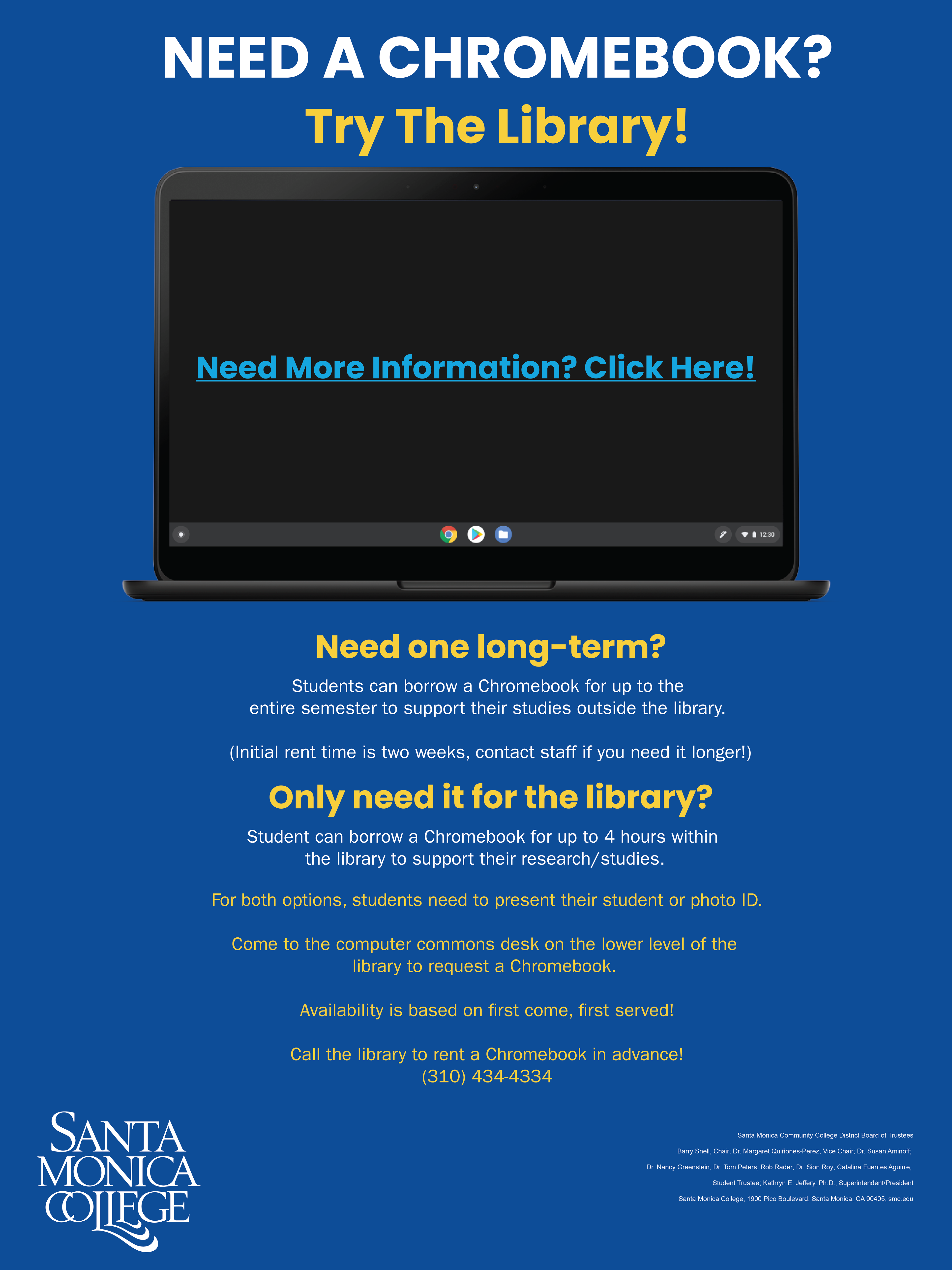
Final Digital Poster Design: Added text explaining that this service was available for all students at SMC.
Results
I created two final poster designs promoting the SMC library’s Chromebook borrowing program: a physical poster, which would be displayed across campus, and a digital poster, which would be sent to students via a mass email. I created a digital poster because I learned from my student interviews that some students weren’t used to using the SMC library or visiting the campus. This was because they had spent the past two years online. Creating a variation of my poster that would be sent as an email was the best way to tell these students about the program. Also, these online students, who depend on computers to complete their schoolwork, might be the ones who would benefit the most from the program.
I placed the directions for obtaining a Chromebook in a yellow box that stands out against the dark blue background. I did this because the contrast between the yellow box and the blue text inside made the information very prominent. I needed to make the posters easy to engage with, so that students could get the most out of them. I decided to make the directions for obtaining a Chromebook stand out so the reader’s eyes would be quickly drawn to them.
The posters also included a way to access a contact sheet for sources of more information. The sheet could be accessed on the physical poster by scanning the QR code. A user could access the sheet by clicking the “Click Here!” link. The sheet provided phone numbers and email addresses for Alexandra Cruz—the woman responsible for lending out Chromebooks at the SMC library—and Walter Butler—the director of library and information services at SMC. I was worried that some students might still feel confused after seeing the poster and would want a way to obtain more information. I felt that including an easy way to contact the staff members most involved in the program would help them. If they had any questions about the library or the Chromebook borrowing program, they could easily call or email staff members.
Reflection
The project was a success because, after printing and hanging up a copy of my completed physical poster, I contacted Alexandra Cruz, who confirmed that more students were asking about the Chromebook borrowing program and even checking them out. I could not get an exact number of students, but the fact that I had increased awareness of the program made me consider the project a success.
But there are ways in which I now realize that I could have made my efforts stronger. I should have made copies of my final physical poster and placed them at several locations across campus so that more students would see them and ask about the Chromebook borrowing program. I could also have experimented with additional designs and made multiple visually distinct posters. I also could have interviewed more SMC students, asked about their personal library experiences, and used that information to create ideas for additional poster material.