SMC Graphic Design Program

Context/Brief
The CMD student showcase is an annual event held by Santa Monica College at its Center for Media & Design campus. The event showcases projects completed by students in film, animation, graphic design, video games, architecture and interior design, journalism, and several other fields.
Industry Project / SPRING 2024_Creating materials to endorse SMC's Graphic Design program.
For this project, I was placed into a design group. The goal of this group throughout the semester was to find a way to attract local businesses to collaborate with SMC's Graphic Design program through digital, print, and social media.
Anyone interested in the event could visit the campus, with the event providing food and beverages.
The event is a great opportunity for students to showcase their work and expand their careers through industry networking.
Visual Assets
Santa Monica College Logo:

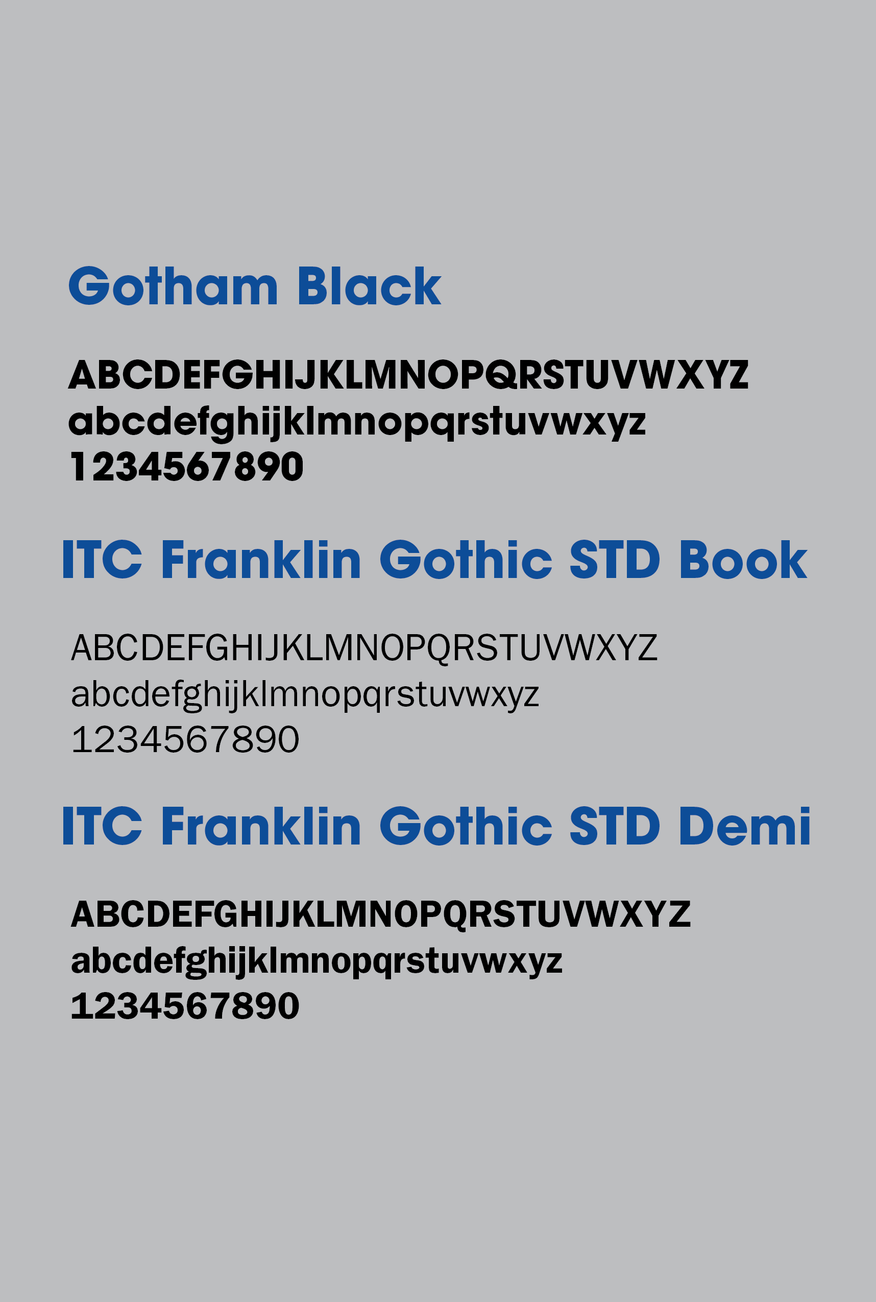
Sample Colors:
The sample color and sample typefaces come from the SMC Brand Style and Logo Guidelines page of the SMC website.

Sample Typefaces:
My Role in the Project
Graphic designer:
•Conducted design research and created group slideshows.
•Made a poster that could be used for the SMC student showcase to encourage collaboration between potential community partners and the SMC Graphic Design program.
•Gathered as much helpful information as possible about the project's background and useful resources, which were shared with the group.
•Created much of the layout for midterm and final presentation slideshows and designed several slides.
My Design Partners:
Mary Thurston: Social media and UX designer. Thurston also created an Instagram account to keep community partners updated. Also created targeted LinkedIn ads where SMC alumni encourage community partners to join the program.
Irvin Rivas: Digital designer. Rivas redesigned the landing page for the SMC Associates program's website.
Nickira King: Digital designer. King created a layout for a sign-up sheet for the Graphic Design program that community partners could use.
Who was the client, what was the brief?
Client:
Santa Monica College Graphic Design Program. (Academic Project)
Brief:
Create materials to promote relationships between the Graphic Design program and community partners such as local businesses, non-profits, and educational institutions. This included digital, print, and social media deliverables.
Project Overview
Problem:
The SMC Graphic Design program needed print, social, and digital deliverables to attract community partners.
Insight:
Our group identified the SMC Associates webpage as a platform for reaching potential community partners. SMC Associates tries to attract community partners to donate and host campus events.
Solution:
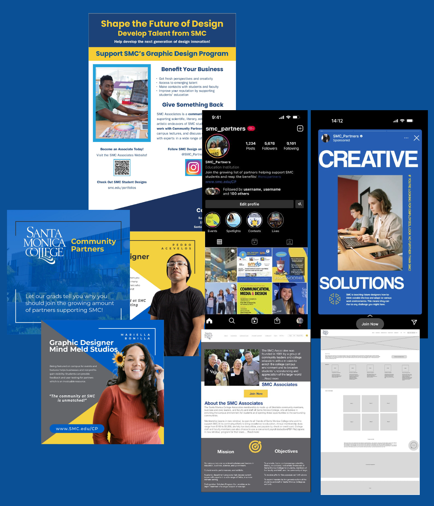
We created deliverables that promote collaboration by existing and future SMC Associates with the SMC Graphic Design program. These deliverables included a poster for the student showcase (designed by me), a redesign of the SMC Associates page, an Instagram account and sponsored story, and a sign-up sheet for the Graphic Design program.
Some of the final deliverables that our group developed during the Spring semester:
Process
I searched for inspiration and created a netnography: a document that stores resources my group could use to help community partners. I also made a persona to focus my concepts, brainstormed sketches, created high-fidelity prototypes, and used feedback from my professor and group members to develop final poster designs.
Research:
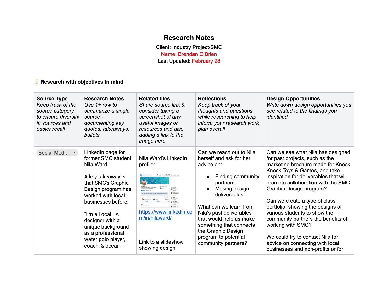
Netnography:
I created a netnography to gather and take notes on resources my team could use as inspiration for our deliverables and to record ideas for designs that came from my research.
Sources included graphic design and employment websites, SMC and alumni websites, and LinkedIn pages.
Story Template:
I created this template to lay out a story that our group could use to drive our actions forward and raise questions we should investigate.
This document provided my group with important questions we asked stakeholders during midterms, which we used to prepare our final deliverables.
Link to the Story Template

My group settled on local businesses as our target audience, with the desired outcome of getting more community partners and job internships. I created posters promoting the SMC Graphic Design program to potential community partners.
Before designing any posters, I needed to brainstorm ideas about how collaboration with the SMC Graphic Design program could benefit local businesses. I also needed to plan where these posters would be placed to best spread the word. Ultimately, my posters were designed to be displayed at the SMC Student Showcase.
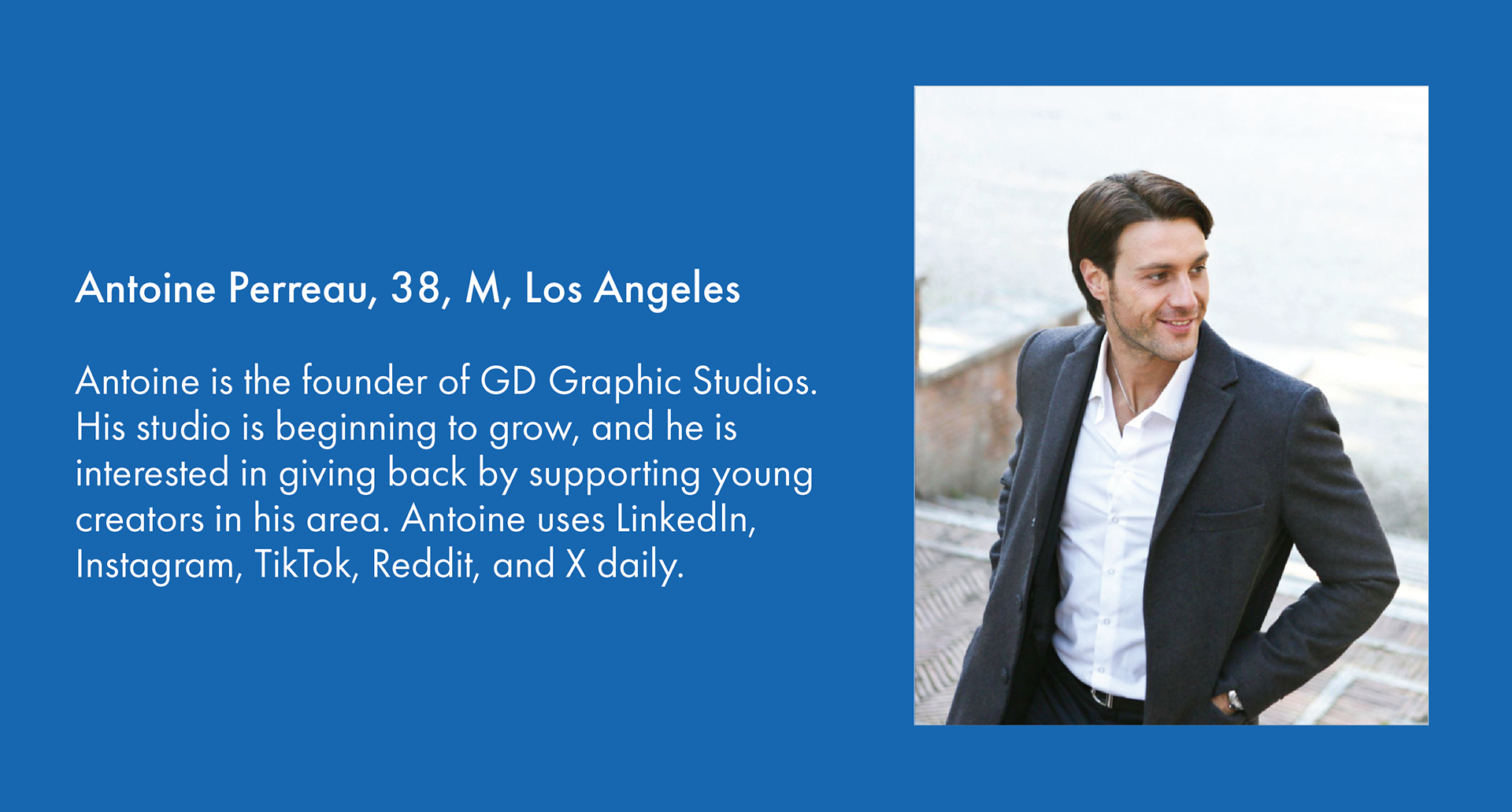
Persona:
Before creating our designs, my group made a persona for reference, which I referred to while creating and refining my poster. At each stage, I would review the persona and ask, "How can I ensure that what I'm making appeals to this guy?" Having a certain audience in mind kept me focused.
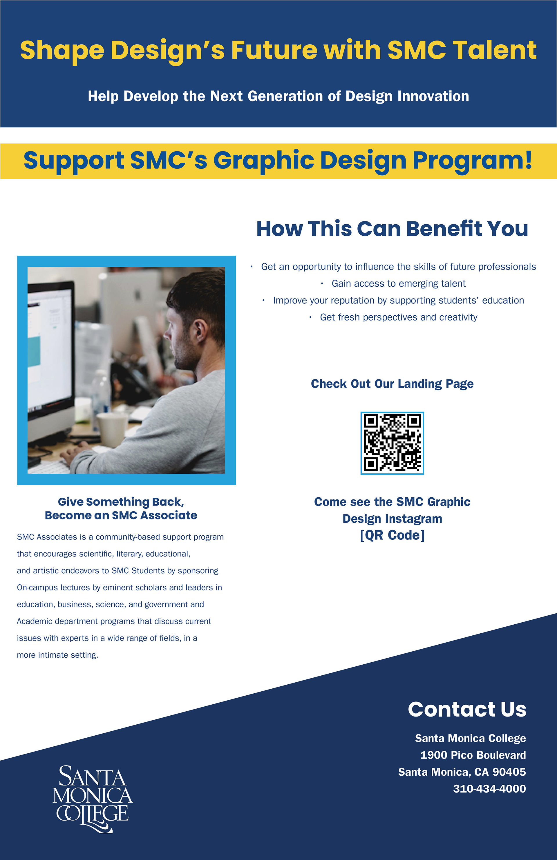
Inspiration:
This poster that I found in my research served as the primary inspiration for my poster. I was captivated by its strong design features:
● Large heading
● Position of imagery
● Sub-headings
● Use of white space
● Color scheme
These elements, when combined, created a visually dynamic poster that would easily capture a viewer’s attention.
Low-fidelity sketches:

Low-fidelity sketch for poster layout based on my inspiration.
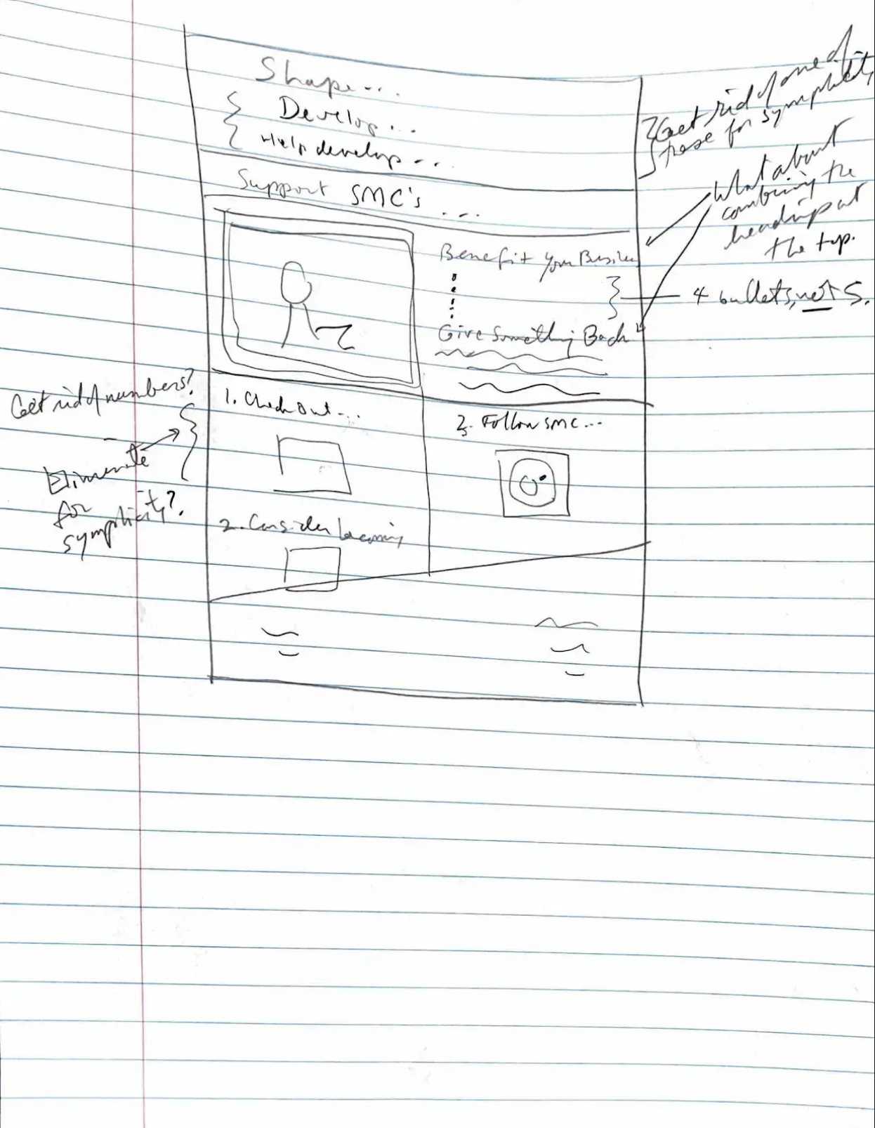
A second sketch discussing possible rearrangements of poster information.
Digital Wireframe:
Mid-fidelity digital wireframe for the poster.
•Attempted to catch people's attention with blunt, eye-catching headlines.
•Replaced the circular picture in my initial sketch with a rectangular one.
• Included a QR code leading to the landing page for the SMC Graphic Design program.

High-Fidelity Poster Iterations:
Iteration 1:
Changes:
•Changed the wording of the headlines to make them more positive and encouraging. Made the top headline yellow to make it more eye-catching.
•Added a yellow banner with "SUPPORT SMC'S GRAPHIC DESIGN PROGRAM!" in dark blue to make the message clear and visually captivating.
•Included a call to action explaining the SMC Associates program and encouraging them to become an SMC Associate.
Iteration 2:
Changes:
•Added a new subtitle reading "Develop Talent from SMC" in yellow text.
•Brought up the yellow banner so that it was touching the blue box at the top of the poster.
•Rephrased the bullet points explaining how supporting the Graphic Design program can benefit businesses. Made them shorter and easier to understand.
•Moved the text explaining the SMC Associates program to the right of the poster.
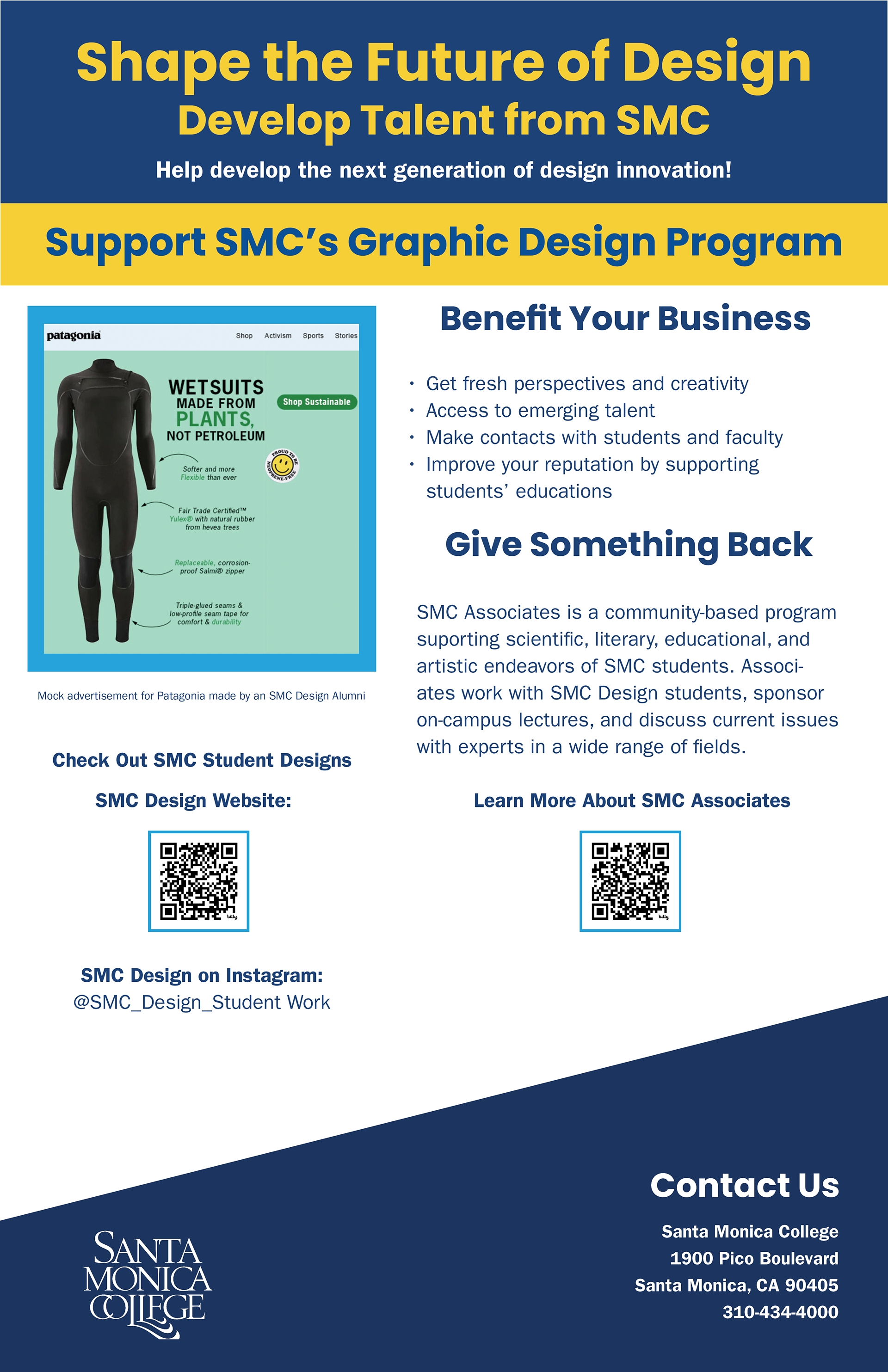
•Replaced the previous image a mock advertisement created by an SMC Design alumna.
•Added a QR Code for the SMC Associates website and included the SMC Design Instagram account's username.
Iteration 3:
Changes:
•Replaced the image in the frame with a picture from the Graphic Design program's website.
•Bolded certain phrases in the text block explaining the SMC Associates program to highlight important information.
•Arranged the QR codes for the SMC Graphic Design and SMC Associates websites vertically instead of side-by-side.
•Included an icon for the SMC Design's Instagram account.
•Placed the icon in a light blue box to reduce whitespace.
•Included numbers for the social media information to create an order in which the viewer would interact with the poster.

Iteration 4:
Changes:
•Replaced the image in the frame with a graphic design image better suited to the frame's dimensions.
•Tried combining "Benefit Your Business" and "Give Something Back."
•Replaced the QR code with a message saying to visit the SMC Associates site, as having two QR codes made the poster look busy.
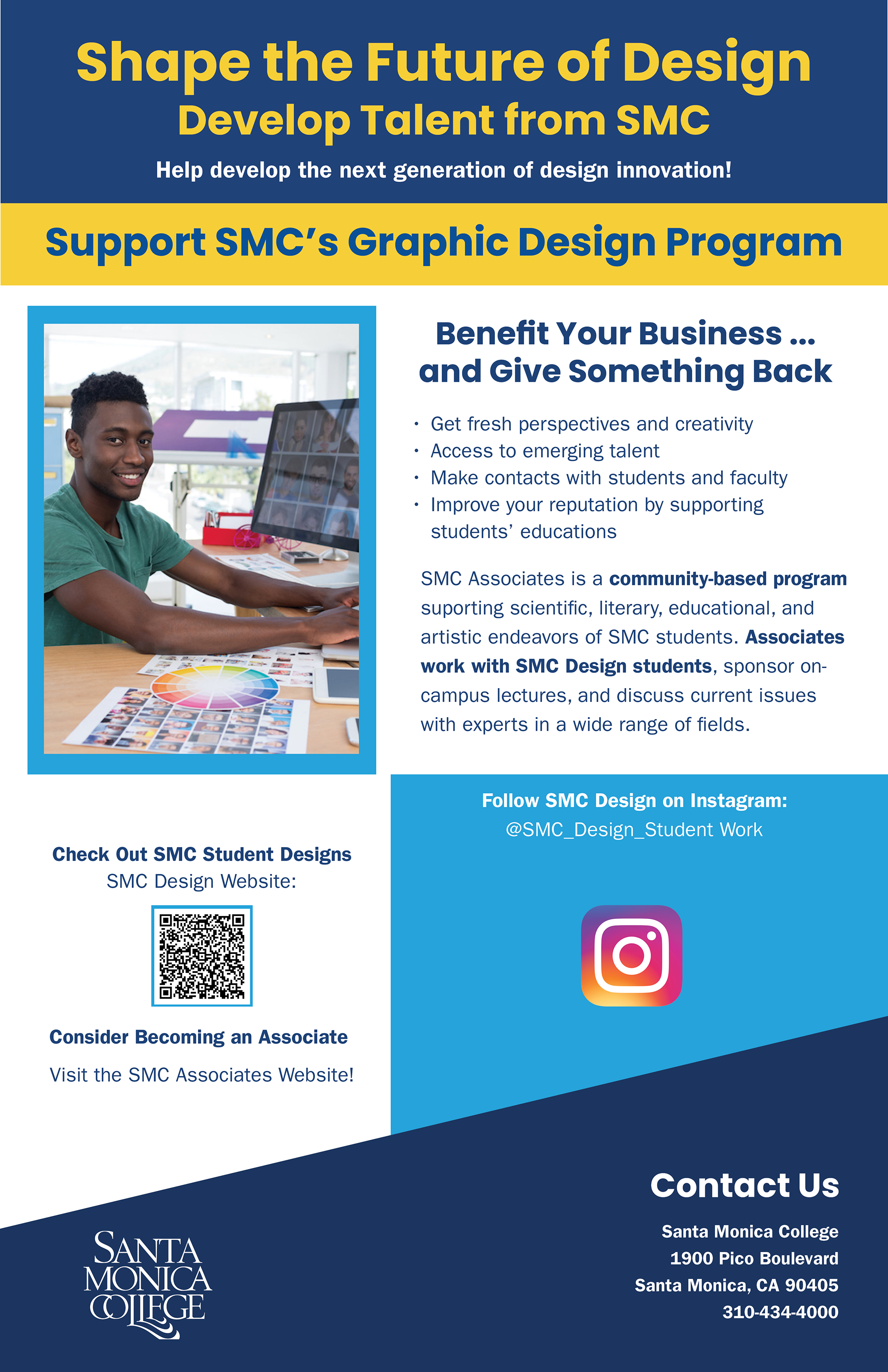
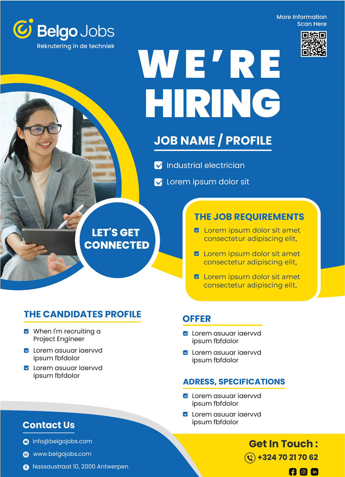
Final Iteration:
Changes:
•Reduced the amount of blue space surrounding the Instagram logo.
•Included a QR code for the SMC Associates website while including a link for SMC Graphic Design student portfolios.
•Split "Benefit Your Business" and "Give Something Back" into separate sections again.

Results
I created a poster promoting the SMC Graphic Design program to community partners such as local businesses, non-profits, and educational institutions. Designing a poster that would be displayed on campus during the CMD student showcase was a good idea because it was an event that would likely attract potential community partners. Posters that explained what visitors could do to support the program and how doing so could benefit them was likely to help convince them to collaborate.
When designing this poster, I sought to include three key elements:
Hierarchy: Helps draw viewers’ attention to the most important information, then guides them to supplemental information.
Contrast: Helps guide viewers through the layout by making the most important information stand out.
Balance: Gives the poster unity and stability so the viewer can easily navigate the contents. It also makes the poster seem professional.
While designing this poster, I realized that I needed to make sure that any elements I added to the design to make it more interesting didn’t make the design distracting or unorganized. For example, having two QR Codes took up too much space, so I replaced one of them with a link. Another example is that the large blue square around the Instagram icon was too distracting. As a result, it needed to be reduced so the poster could be easily navigated.
Reflection
I consider this project a success because I provided all the necessary information in an easy-to-understand and visually appealing way. In addition, when my poster designs were being shown to representative stakeholders during the final week of the semester, they loved what I presented. They especially loved the inclusion of a "Benefits" section and a "Give Something Back" section in the poster, because business owners want to benefit their businesses and also serve the community. Stakeholders felt that my design effectively appealed to these two desires.
Quotes from the stakeholders:
“I noticed in the poster there was a section about the benefits. You know the local business will learn what the benefits will be if they were to participate in this program.”
“I really appreciated the ‘Give Something Back’ section. I’m assuming that’s more of a call to action to pay it forward. So they’re enticed to participate.”