
McCabe's Guitar Shop

Context/Brief
McCabe's Guitar Shop is a musical instrument store in Santa Monica, California, that doubles as a live music venue. Opened in 1958, McCabe's sells a variety of acoustic and folk instruments.
User Experience Design 1 / SPRING 2023_Redesign of an existing local business website.
This was a group project for McCabe's Guitar Shop. This project aimed to create a redesign that would appeal to McCabes' primary audiences: Musicians of all levels (beginner to seasoned experts), music lovers of all ages, guitar and stringed instrument collectors, and concert-goers.
Our redesign needed to reflect the casual, friendly, and human personality that McCabe's wanted to express for its brand.
Visual Assets
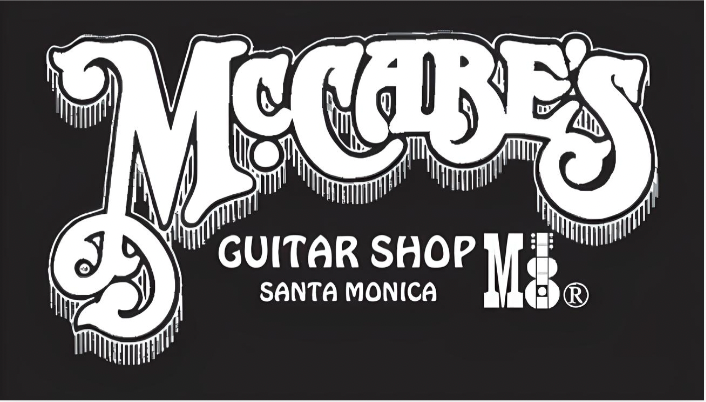
McCabe's Logo:
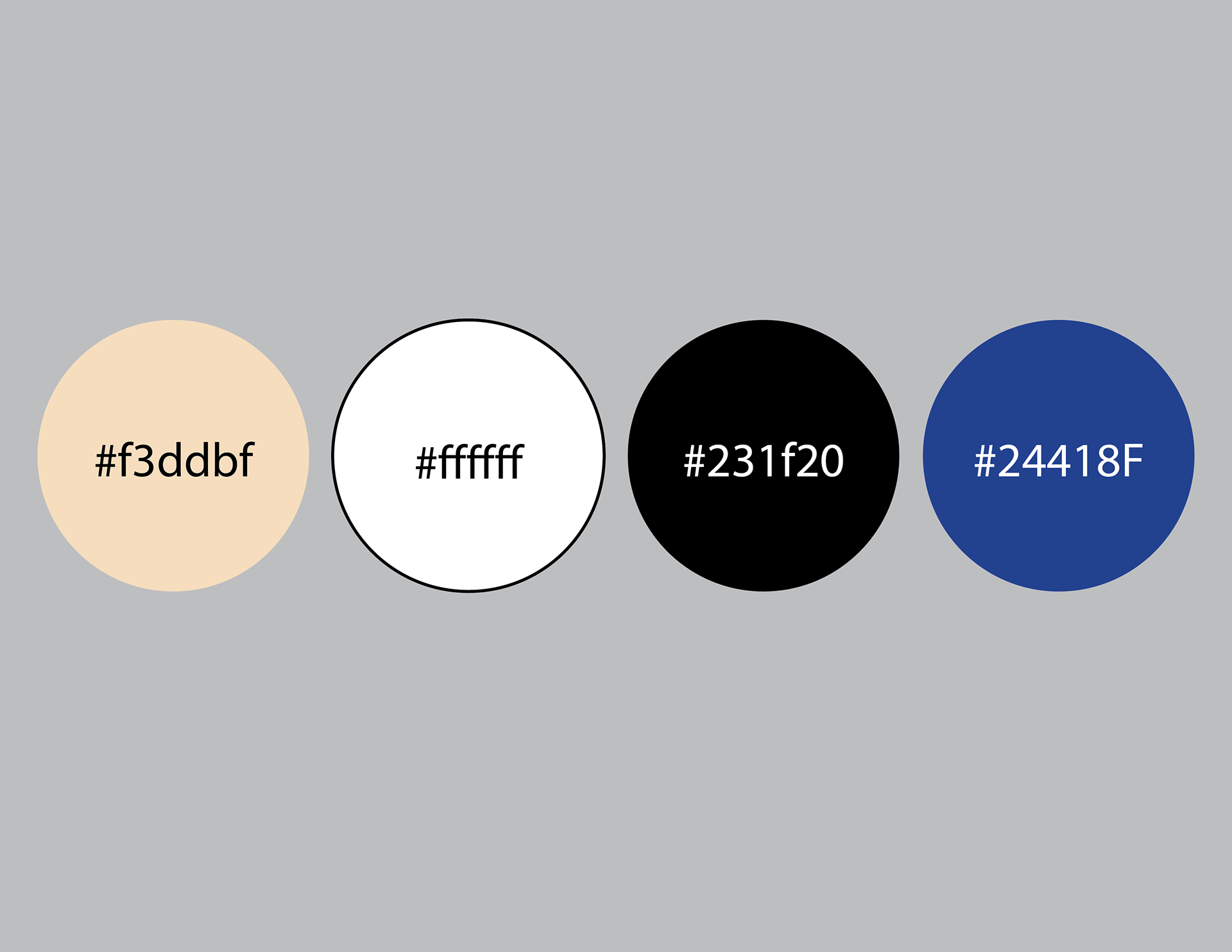
Sample Colors:
Current design palette for McCabe's Guitar Shop branding.
Sample Typefaces:
Typefaces for the brand identity.

My Role in the Project
Graphic designer:
•Conducted design research and created group slideshows.
•Redesigned the desktop and mobile website layout.
•Gathered design inspiration from other guitar shops and conducted user interviews, created personas, experience maps, a card sort, a feature matrix, and a sitemap.
My Design Partners:
Teruhiro Hiramatsu: UX designer and information gatherer. Hiramatsu gathered information from competing brands, conducted interviews, created personas and an experience map, and gave feedback on and edited the website redesign based on his findings.
Yooji Chae: UX designer and information gatherer. Chae gathered information from competing brands, conducted interviews, created personas and an experience map, and gave feedback on and edited the website redesign based on his findings.
Who was the client, what was the brief?
Client:
McCabe's Guitar Shop.
Brief:
Redesign the website for McCabe's Guitar Shop in a way that appealed to its target audiences:
Primary audiences for this website:
•Musicians of all levels (beginner to seasoned expert)
• Music lovers of all ages
•Guitar and stringed instrument collectors
•Concert-goers
Secondary audiences:
•Music teachers
•Future employees
•Press
The redesign also needed to be responsive and reflect the personality of the brand:
•Homey
•Casual/informal
•Friendly
•Human
Project Overview
Problem:
The website for McCabe's Guitar Shop is in dire need of an update.
Insight:
From my research of competing brands and user interviews, I found out that there were many ways that the layout could be improved, such as using a consistent structure for the products page, altering the mobile layout so that no information was obscured, and including ratings for products from previous customers.
Solution:
My group researched what competing brands were doing with their websites, interviewed users, and created personas. We then took the information we had gathered and tried to redesign the website layout in a way that would be easy for users to understand and enjoyable to navigate.
Process
I analyzed the existing website design for possible improvements, analyzed a competing brand for inspiration, conducted a user interview with a person who had previous experience with the McCabe's website, created a persona and an experience map for them, performed a card sort with another subject to determine ideas on how to organize the site's information, solidified organization of content with a feature matrix, and redesigned the website.
Research:
Heuristic Analysis:
Examined the current website design for McCabe's Guitar Shop and spotted design elements on the desktop and mobile layouts that could be improved.
Found that the website needed clearer navigation and easier access to information.
For example, on the mobile version of the website, the tab that allows a user to change the website's language is blocking the store's phone number.
On the desktop version of the website, it was difficult to tell whether or not certain pieces of information were clickable.
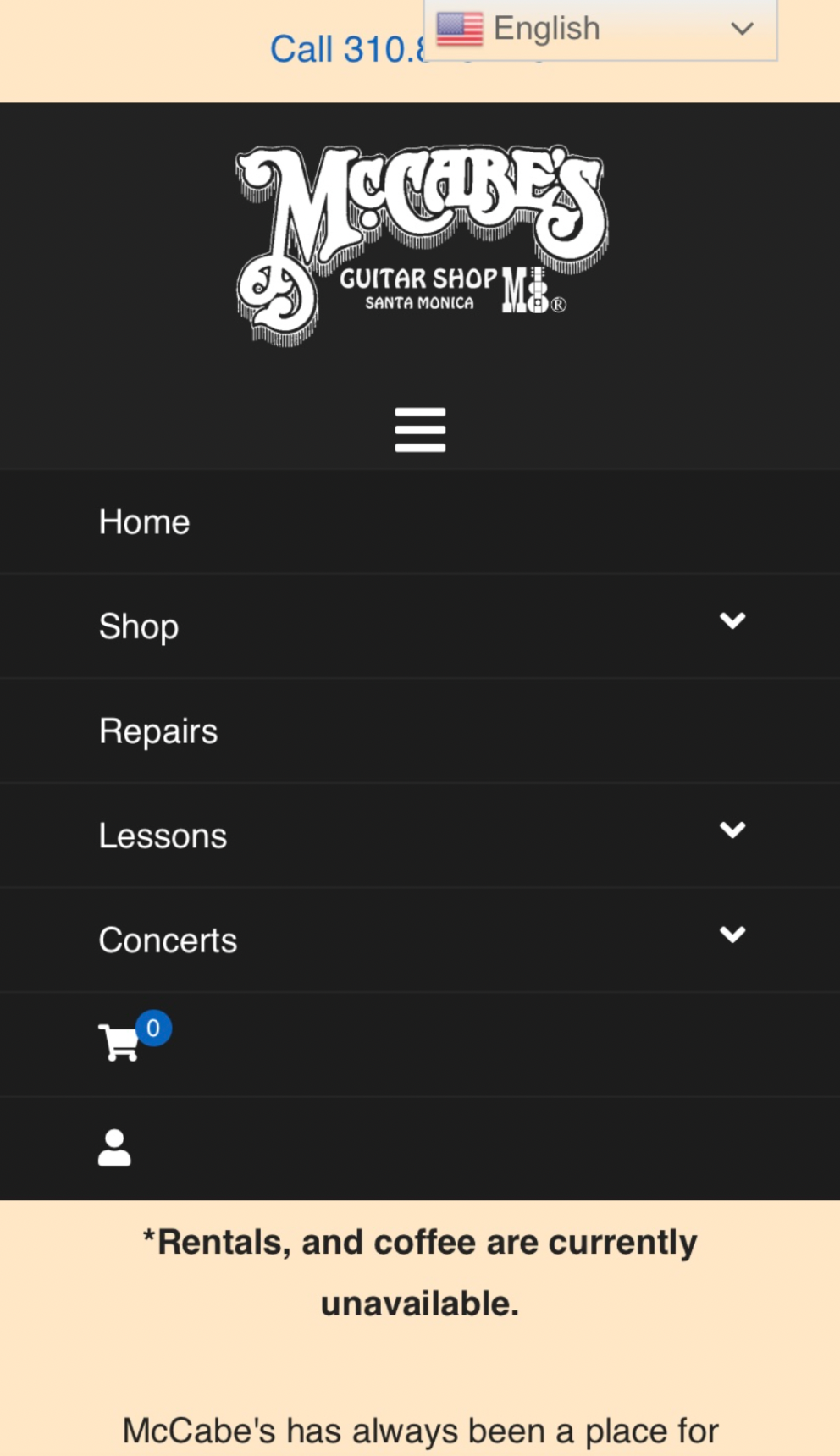
The navigation menu on the McCabe's mobile website.
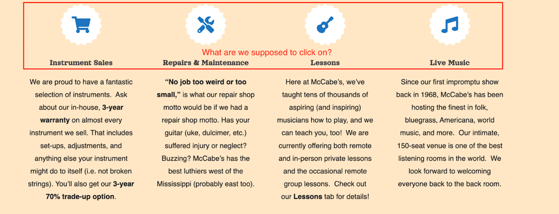
I was unable to tell whether the white icons on McCabe's homepage were clickable.
Competitive Analysis:
I examined the website for Truetone Music, a music store listed on the creative brief as one of McCabe's competitors. It had several features that McCabe's could include to reduce whatever confusion their users were experiencing.
For example, unlike McCabe's website, pieces of information on Truetone's site, like the address and phone number, were put at the top of the screen. Pictures that link to products and their brands could be found at the center of the page layout, and, pictures leading to social media posts could be found at the bottom. This could provide a more convenient experience for a user who needs to look up basic information about the brand and is in a rush. Another feature that could quickly reduce a user's confusion is a live chat that can be accessed on any page by clicking a button on the site, allowing the user to message the store instantly.
Link to the full Competitive Analysis
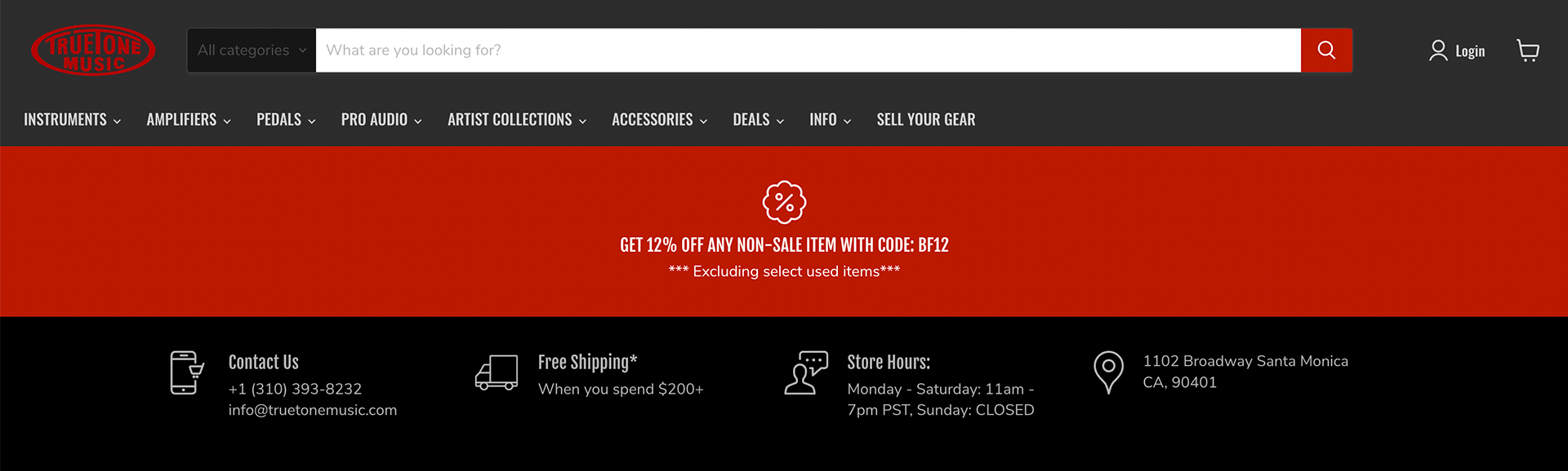
Truetone's homepage information
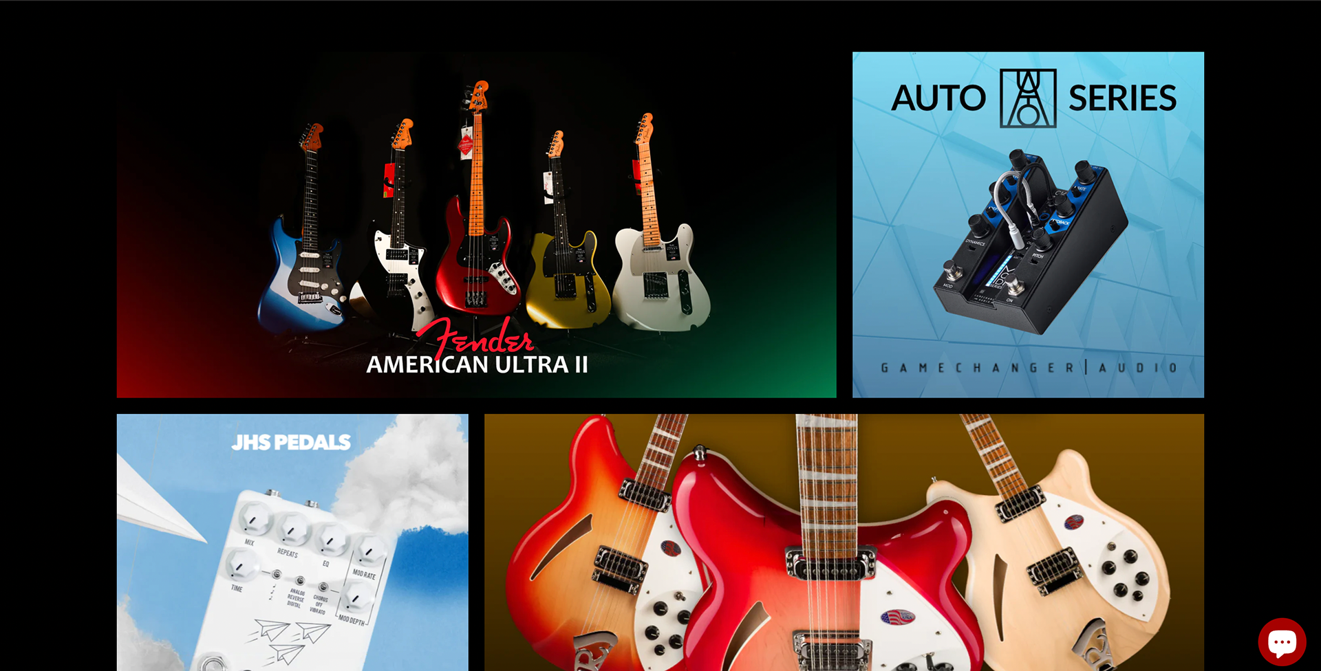
Additional information, located near the bottom.
Interviews:
I reached out to my friend Skiddy, who was a beginner with the guitar, practicing as a hobbyist. He also had previous experience using the McCabe's website. Based on the information I received from him and the other interviews conducted by my teammates, my group learned:
When buying instruments online, users look for:
•Simplicity
•Quality
Interviewees preferred buying instruments from physical stores:
•More certainty
•Can interact with and test products
Interviewees would be interested in attending a concert at McCabe’s.
There were several Flaws in the mobile site:
•Overlapping clickable buttons
•Homepage difficult to navigate
•Sub-optimal information placement
New features inspired by interviews:
•Total price given upfront
•Order tracking
•Order updates
Persona:
Gemma Hendricks, 19, F, Santa Monica
Gemma is a student at Santa Monica College who works a part-time job at a Barnes & Noble bookstore.
She is interested in visiting the website for McCabe's because she's interested in taking lessons. Her friends are starting a rock and roll band, and she wants to learn how to play guitar so she can join them.
She would be interested in the site's options of taking either group or private lessons.

Experience Map:
This experience map helped create an ideal scenario for how I wanted my persona to interact with my design.
•Reads instructor descriptions to make a choice.
•Interest in special offers from the site.
•Interest in the site’s social media.
•Open to group lessons with committed students.

Card Sorts:
This card sort was created to understand how users interact with and categorize information. I provided the user with several cards showing features that would be put on the website and instructed him to create categories to sort them into.
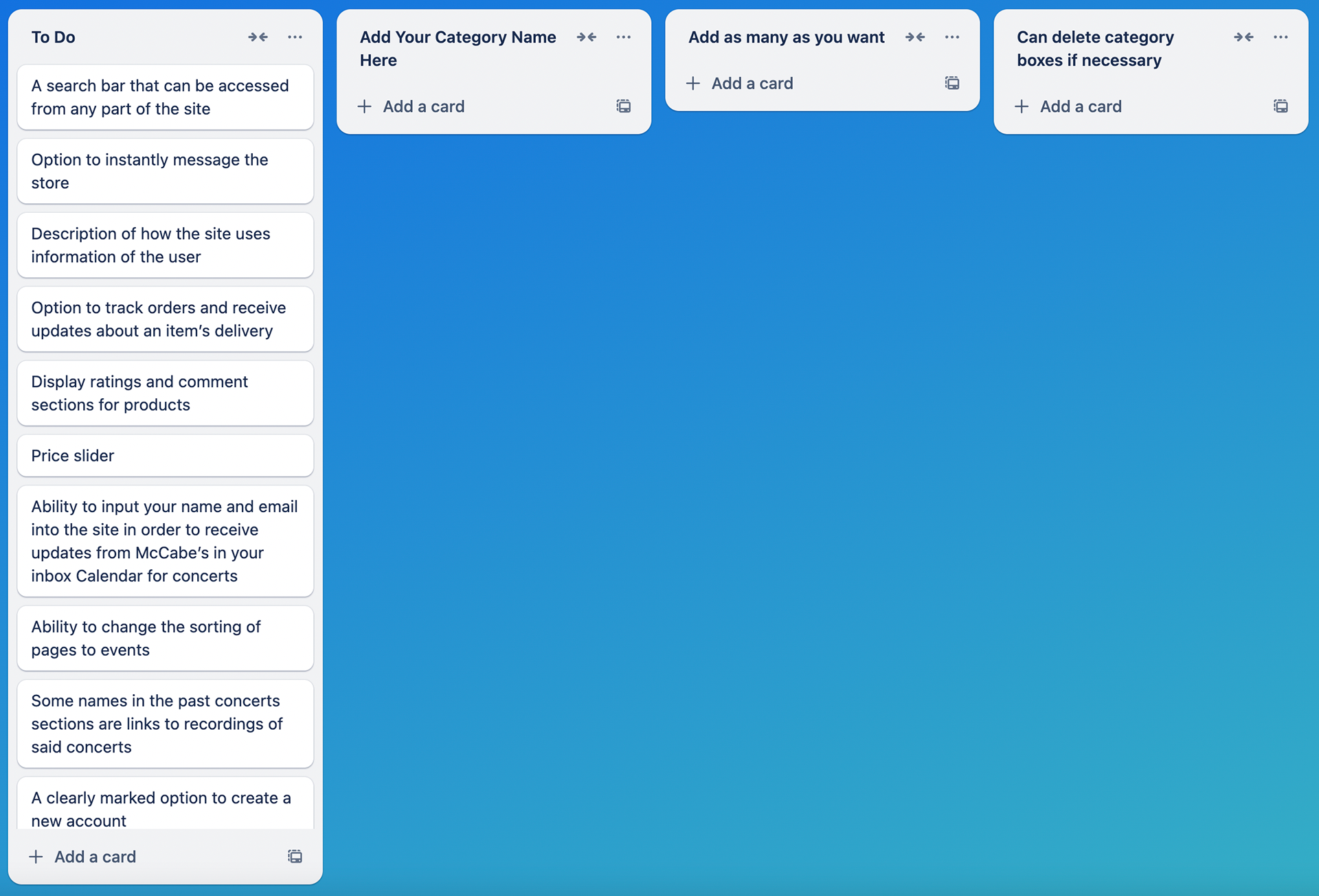
Sample card sort
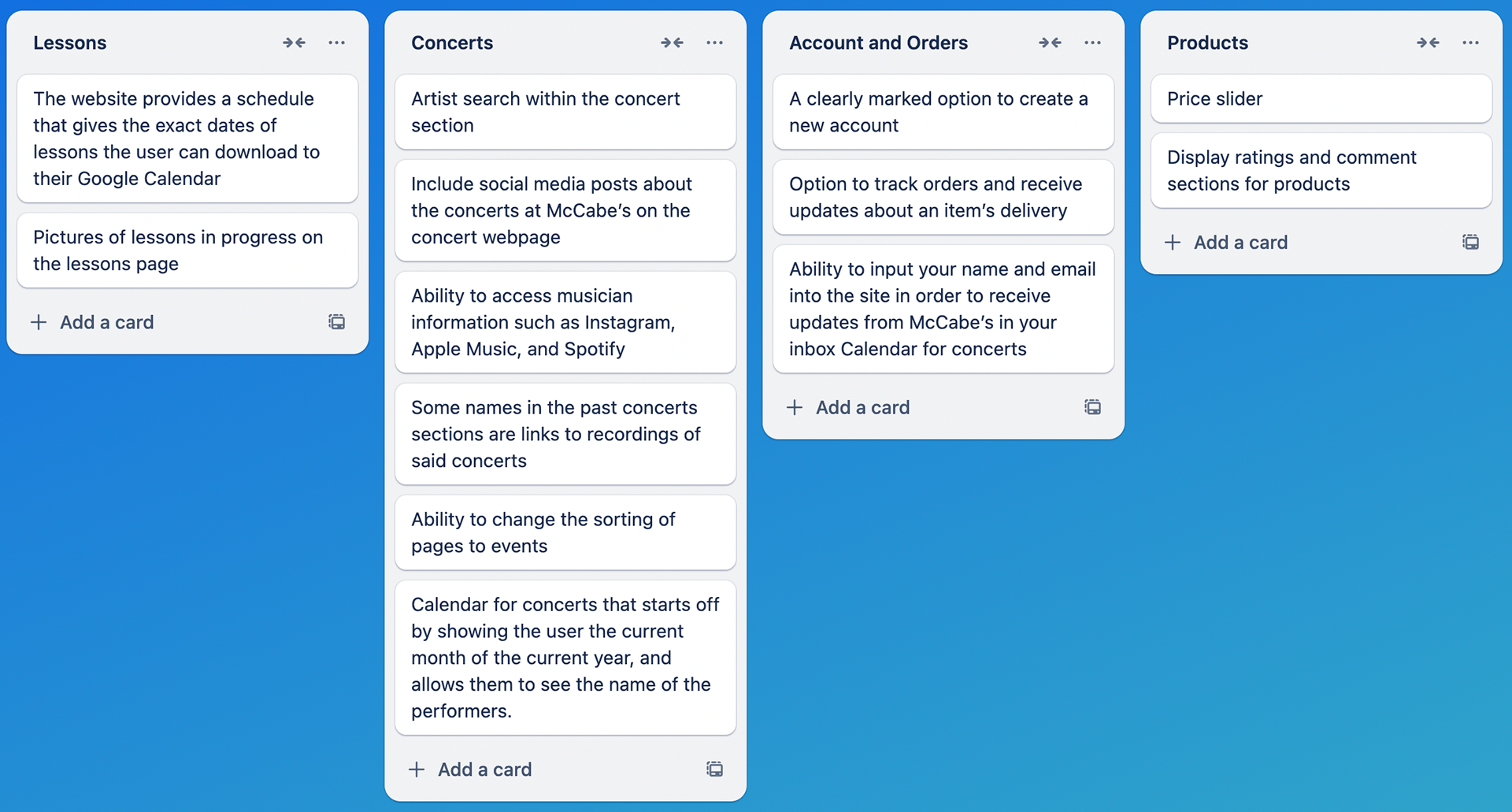
Card sort filled out by the user.
These card sorts were created to understand how users interact with and categorize information. I provided the user with several cards showing features that would be included in the website and instructed him to create categories to sort them into.
Feature Matrix:
Important product features for our group's personas:
•Brand logos on the Home Page act as clickable links and take users to a special products page for an instrument belonging to that brand.
•Currently, brand logos, while prominent, aren’t clickable. Users might expect them to be clickable due to the emphasis put on them.
•A site search that can be accessed from any part of the website.
•Display ratings and comments sections for products
•Pictures of lessons in progress on the Lessons page.
•Social media posts about concerts at McCabe’s on the Concert webpage.
•Concert Calendar that shows all concerts in the current month and the names of the performers. (The user must hover the cursor over concert day.)

Final Sitemap:
•My initial process was to go through the site, taking notes of things like separate pages and special or new features.
•I wanted to list the features alongside the site pages so people could understand what I wanted to change.
•I added new features to the sitemap: logos being clickable links and the separate pages they would take a user to in the shop section.
Link to the sitemap
Digital Wireframes:
Mid-fidelity digital wireframes that I created for the homepage and the products page for both a desktop and mobile layout.
•These layouts had several placeholder boxes and descriptive text indicating where certain features would go.
•The images for the "Brands We Carry" and "Language" drop-down menus were initially black and white. This was done to make them stand out against the tan background.
•I had to turn in these variations as assignments throughout the semester. One of the requirements for submission was that my name had to be on my designs.
Desktop Website Layout:
Front Page

Products Page
Mobile Website Layout:
(Clockwise) The homepage, navigation page, and products page of the mobile website layout.

High-Fidelity Website Layouts:
Iteration 1:
Changes:
•Replaced the placeholder boxes and text with the shop's logo, images of products and social media, descriptions of the store and its services, contact information, and the price slider
•The drop-down menus for "Brands we Carry" and "Language" were changed from black and white to color after I realized they were visually distracting.
•I included the words "Live Chat" on the Live Chat button. I felt that doing this would make what the button did as obvious as possible. I was worried that, even though I had included a text bubble in the icon, some users might not know what it was.
•On the Products page of the desktop layout, I displayed an open "Just In!" drop-down menu, allowing viewers to see what new products and services were available.
Desktop Website Layout:

Front Page
Products Page
Mobile Website Layout:
Same order as the previous iteration.


Final Iterations:
Changes:
•Moved the "McCabe's News in Your Inbox" and "Yelp Reviews" boxes upwards so they would better align with the top of the guitar image on the desktop homepage.
•Centered the text and icon for the "Brands We Carry" drop-down menu on the desktop website layout.
•Corrected a typo on the mobile website layout that had previously gone unnoticed.
Final Desktop Website Layout:

Final Mobile Website Layout:


Results
I created a redesign of the home page and products page for both the desktop and mobile layouts of McCabe's website. I redesigned these two pages because I felt they might be the two most important ones. The homepage is the first page you see when you log on, and the products page shows what instruments are in stock. I also had to design a navigation page for the mobile layout because the search icons on the desktop version wouldn't fit on a phone screen.
I put at the top the information I felt was important, such as search filters, language selections, a price slider, contact information, and the store's address. This was done so these elements could easily be spotted by visitors. I wanted to ensure that viewers immediately see all of the information that would allow them to quickly understand the website.
I put the brands of instruments that the store carries in a drop-down menu, because I felt that having the brands displayed at all times might cause the design to be overly crowded.
I chose to make the icons for the store's different services clickable, because I felt that they were eye-catching enough to draw a viewer's attention, and they looked like buttons.
Reflection
These redesigns were never presented to the stakeholders for McCabe's Guitar Shop because they were part of a purely academic project. However, I consider the project a success, because I successfully adhered to the casual, friendly, and human tone of the brand while presenting all the important information in an easily navigable way.
However, there is one way I feel like my designs could have been improved. For several parts of the layouts, I took screenshots from the current layout of McCabe's Guitar Shop and used them in my designs. Sometimes, there would be minor color differences that might distract a viewer, which went unnoticed until much later. If I had more time, I would have used those screenshots only as visual inspiration and created improved versions of their content in Adobe Illustrator.