Hunter's Moon Stables
Ad: Event Program
Context/Brief
During Christmas of 2023, my Aunt visited. She brought up the idea of my creating graphic designs for Hunter's Moon stables, where she was employed. I told her I would be more than willing to help make designs whenever needed.
My Aunt contacted me asking for help creating an ad for the stable's event program.
She sent me several visual assets, including the logo for the stable, a photo she wanted to be prominent in the poster's design, sample text, and sample colors.
Visual Assets
Pictures

The logo for Hunter's Moon stables.

The photo that would be included in the poster.
Sample Text:
Thank you to the wonderful team at Hunter’s Moon Stables for making 2023 so rewarding and so much FUN!
Looking forward to an exciting 2024 show season.
Special thanks to everyone at Brookside Equestrian Park for making us feel so at home.
Sample Colors:
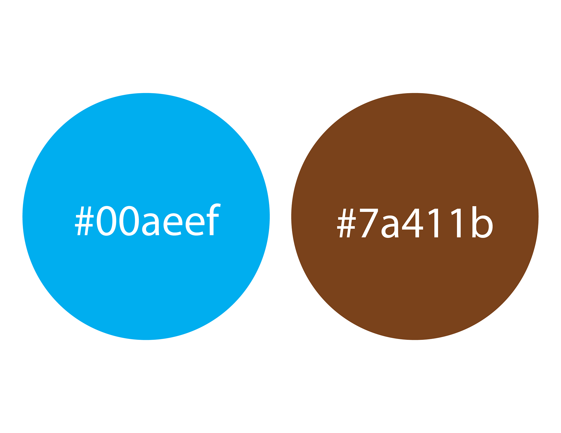
The stable's colors were light blue and chocolate brown.
Sample Typefaces:
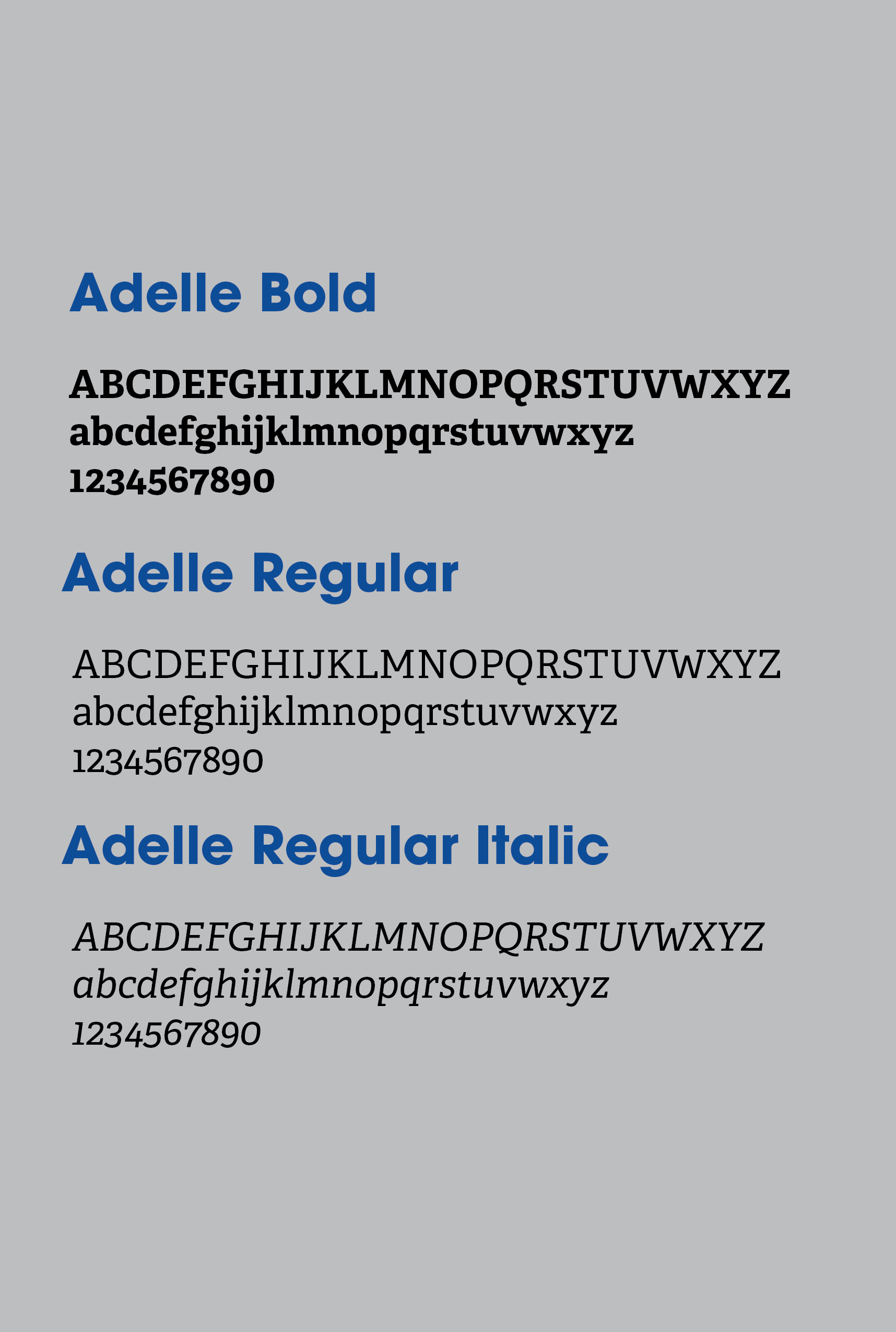
My Aunt said there were no required typefaces for Hunter's Moon Stables, so I settled on using the Adelle typeface because I thought it was visually appealing.
My Role in the Project
Graphic Designer: I performed design research, met with stakeholders, and created a poster thanking the staff at Hunter's Moon Stables and Brookside Equestrian Park.
Who was the client, what was the brief?
Client:
Hunter's Moon Stables.
Brief:
Create a poster that would serve as an ad for the stables' events program.
Project Overview
Problem:
Hunter's Moon Stables needed to show its thanks to its staff and the people working for the Brookside Equestrian Park for their hard work in 2023.
Insight:
An insight I gained was that the visual appearance of the poster needed to show a clear connection to Hunter's Moon Stables as a brand. I learned from consulting with my Aunt that the colors of the stables' barn were light blue and chocolate brown, so I used those colors for the text in the poster.
Solution:
I created a physical poster with all the information that needed to be printed in the program for the Stables' awards banquet. This poster was designed to show gratitude towards the staff who helped the stable in 2023 and reflected the Stable's brand identity.
Process
I reached out to stakeholders, adhered to brand visuals, brainstormed a sketch, created a low and mid-fidelity prototype, added the brand's logo and additional text, and used feedback from stakeholders in order to create the final design.
Initial Poster Sketch:
Once I received all of the visual information, I started by creating this simple sketch on paper. After completing the sketch, I tried converting it into a digital layout using Adobe Illustrator. But in the process, I realized that my initial placement of materials wouldn't work.

First digital poster layout:
My initial digital design. I decided the best place for the logo would be on the left side of the paper near the bottom, and the special thanks message placed to the right of it. This layout lacks the logo, as I did not have a PNG of the image when I created it.
My Aunt was pleased with my design, but she had some suggestions. She recommended that the size of the "THANK YOU..." be decreased and that I add the phrase “Looking forward to an exciting 2024 Show Season."
I used these recommendations to create my final poster design.
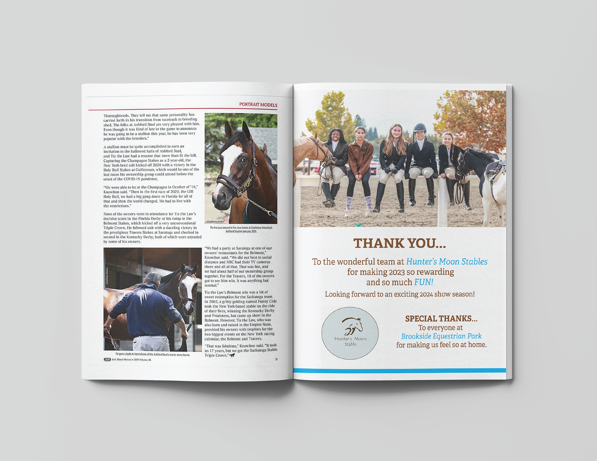
Final Iteration
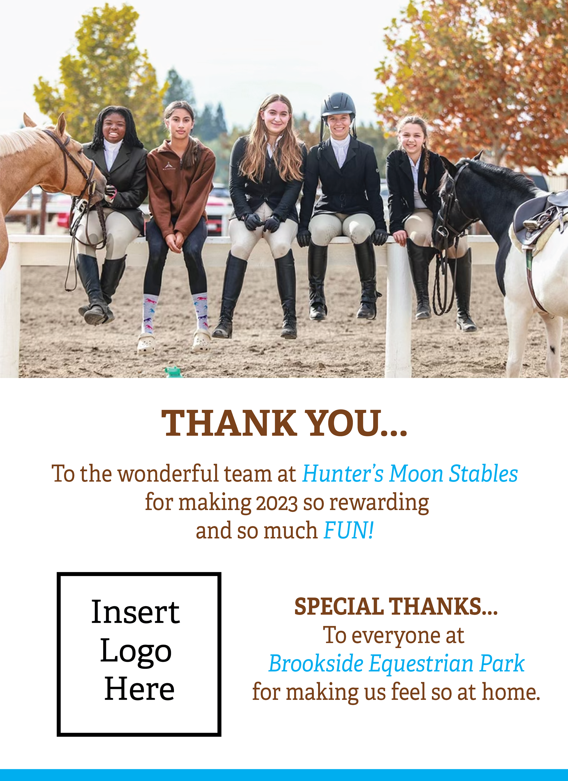
This design was published in the stable's events program.

Results
I created a physical poster published in the stable's events program. I chose to have the photograph take up most of the space on top, because I thought it was visually captivating. Emphasizing the photo quickly drew attention to the poster. I also included the thank you message to the stable's staff directly below the picture in large text so it would be quickly noticed. By placing the special thanks to Brookside Equestrian Park on the bottom right, I wanted to create a descending order in which the viewer could read the poster, guiding the viewer's eyes from top to bottom.
I also used Hunter's Moon Stables' brand colors by making the text the same chocolate brown while using light blue to emphasize particular pieces of information.
Reflection
This project was a success because it was shown to the staff at Hunter's Moon Stables, who approved the design and included it in the events program.
Looking back on this project, I now realize that there are ways in which I could have made my efforts stronger. I should have tried to create multiple sketches. If I had taken more time to brainstorm more potential layouts, I could have created a more visually distinct poster.
I also wish that I had experimented some more with the "THANK YOU" text to make it stand out more against the rest of the chocolate brown text. Perhaps I could have made the text light blue or white inside of a light blue box stretching to both sides of the poster.
Poster
Context/Brief
In August of 2024, my Aunt contacted me asking for help with a design. The stable needed to sell a horse named Rosie.
Our solution was to design a "For Sale" poster, which would include information about the horse, such as her name and age and what it is like to ride it. We also included the location of Brookside Equestrian Park, where the horse could be purchased, and my Aunt's phone number so curious buyers could reach her for more information.
This poster would let potential buyers know the horse was for sale and encourage a purchase.
Visual Assets
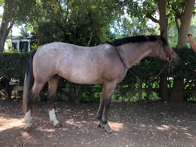
An image of Rosie the horse. This would be the most prominent image on the poster layout.
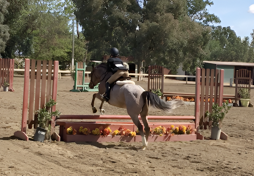
An image of Rosie jumping. This would be placed next to a description of Rosie, which would include her height, age, what it was like to ride her, and where she could be purchased.
Sample Text:
“ROSIE”
Pony mare. 14.1 1/2 hands with a permanent card. 14 years old
Easy to ride with three good gaits. Wonderful to jump, honest, and rhythmic. Looking for a loving home with an ambitious rider. Priced for quick sale. Located at Brookside Equestrian Park, Elk Grove, CA.
Contact Chris O’Brien (916) 812-2624 for more information.
My Role in the Project
Graphic Designer: I met with stakeholders and created a poster advertising Rosie, a horse for sale at Hunter's Moon Stables.
Who was the client, what was the brief?
Client:
Hunter's Moon Stables.
Brief:
Create a poster to show the potential buyers that Hunter's Moon Stables has a horse for sale.
Project Overview
Problem:
Hunter's Moon Stables needed to find a way to let people know that one of its horses, Rosie, was for sale and to describe Rosie's traits so potential customers could decide whether they might be interested in buying her.
Insight:
An insight I gained was that people don't often take time to view random posters unless they're visually interesting. A poster that immediately gets someone's attention has the best chance of convincing them to pause and read it.
Solution:
I created a physical poster that communicates all the information about Rosie the horse, where to buy her, and where to get more information. The poster was designed to catch a person's eye while still conforming to the colors of the brand.
Process
I reached out to stakeholders, helped edit the visuals so they could be displayed in the picture, brainstormed a sketch, created low-and high-fidelity prototypes, and used feedback from stakeholders to create the final design.
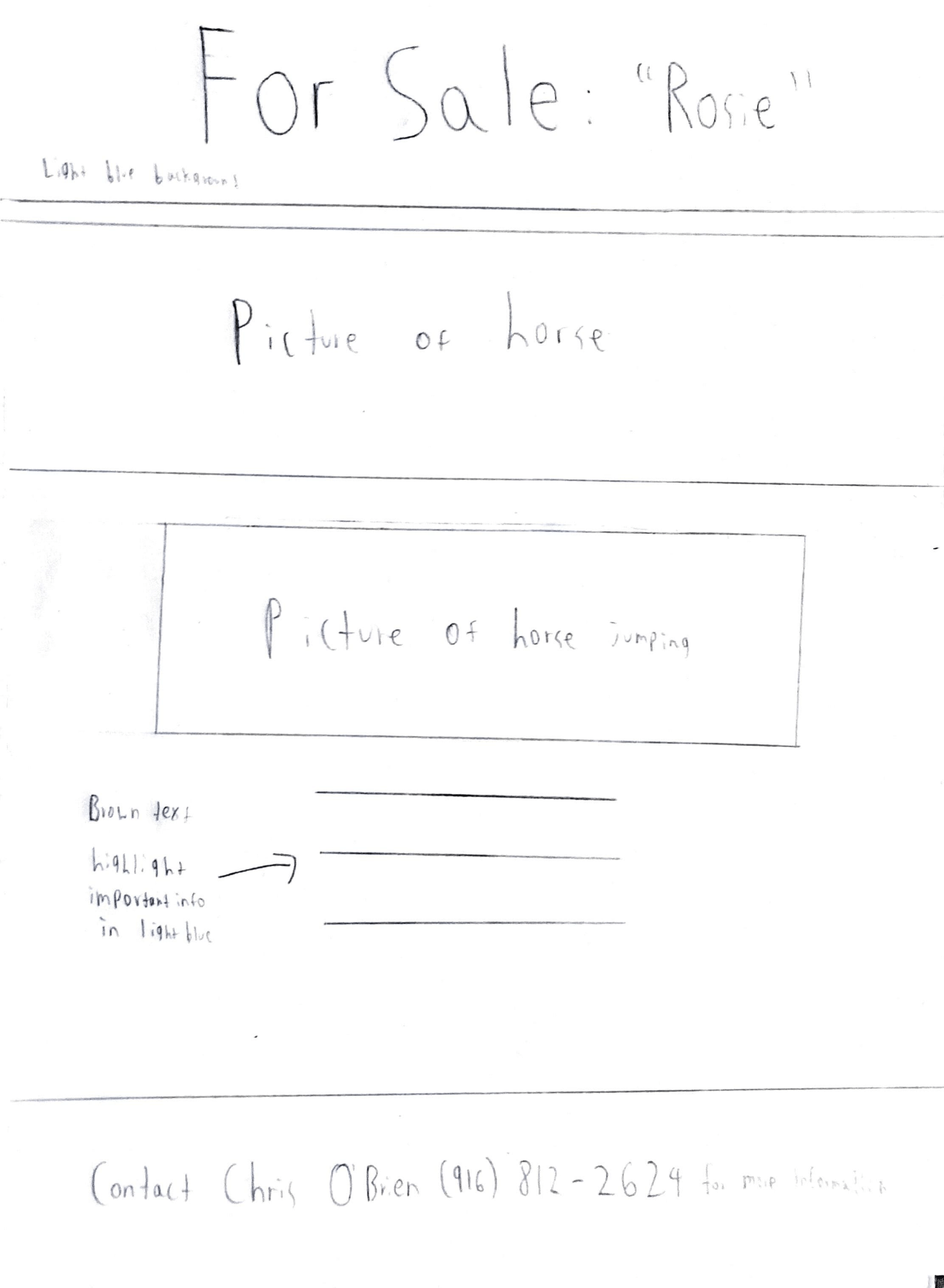
Initial Poster Sketch:
I made a sketch showing the layout I originally planned for the poster. I initially planned to center all the images and text describing the horse. However, I decided that the result was cramped and not sufficiently interesting.
First digital poster layout:
My initial digital design had a side view of Rosie on top, with the image of her jumping right aligned and the text describing her to the right of it. A problem with this layout is that her feet were cropped out of the upper photo.

My Aunt was open to any ideas I had to rearrange the content she had provided to me.
My Aunt enjoyed this initial design, but she pointed out that it was important for buyers to see the horses' hooves. This made me realize that, by cropping the centered image of Rosie to make it fit into the poster, I had cut out information important to those buyers. For the final version of the poster, the horse's entire body would need to be included.
Final Iteration
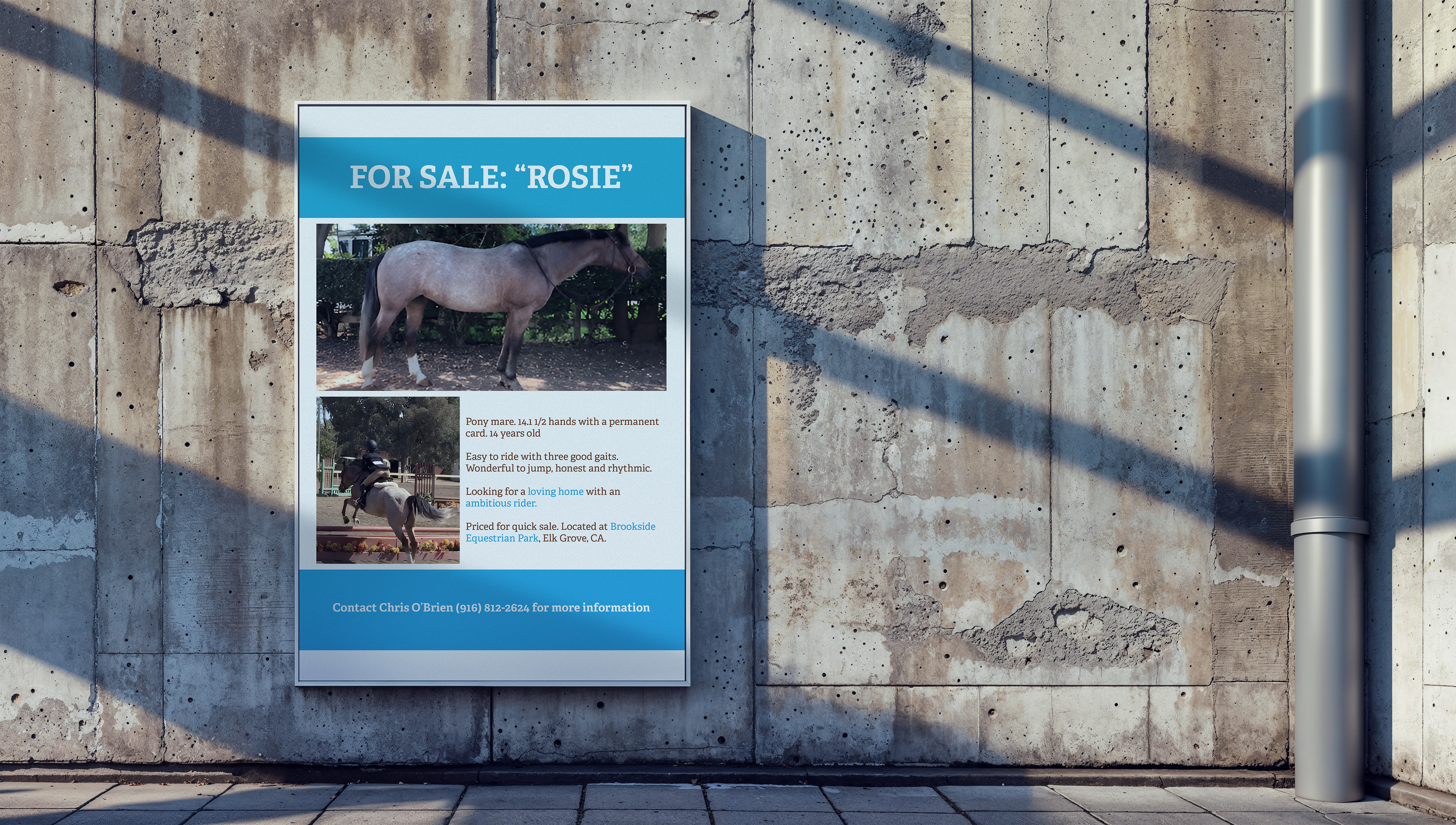
This final version of the poster was printed out and used by Hunter's Moon stables.

Results
I created a physical poster that led to the successful sale of Rosie, the horse from Hunter's Moon Stables. The text, "FOR SALE: 'ROSIE'" and a picture of the horse are the largest visual elements on the poster. I made these items large because I believed that they would provide a visual punch and make the poster more eye-catching to anyone who might be passing by. I placed the top and bottom text in light blue boxes for the same reason. They provide a splash of color that emphasizes the stated information and makes it more likely to be noticed.
I used chocolate brown text for the text describing Rosie's traits, changing its color to light blue to highlight certain important information, such as what type of rider is right for the horse and where she can be purchased.
Reflection
I consider this project a success because it was accepted by the staff at Hunter's Moon Stables and was successful in getting Rosie the horse sold.
I also wish I could have made the white portion of the poster slightly less cramped. I feel that I placed some pieces of information too close to each other. Lack of space between objects runs the risk of overwhelming and confusing a viewer, which is the last thing any piece of graphic design should do. Thankfully, in this poster, that wasn't the case, but I should have considered decreasing the size of the pictures to give the viewer's eyes additional breathing room.