Fuel for Finals Week
Context/Brief
Fuel for Finals Week is an event that provides students with free breakfast, lunch, and snacks during finals week to help them replenish their energy.
Interactive Advertising / Fall 2023_Promoting Fuel for Finals Week
The sponsors for Fuel for Finals Week wanted to increase awareness of the event and what it had to offer.
The goals of the project were to:
• Inform more students about the Fuel for Finals Week events.
• Promote the events’ options for free food.
• Let students know that their college truly cares about them and wants to support them during finals week.
I created posters for the event, which were hung around the SMC campus to inform students.
The sponsors for the event were the college's SMC Cares and Associated Students programs.
The posters were hung on campus from December 1-14
• This was so that the posters would notify students well before finals week so they could make plans to visit.
Visual Assets
Santa Monica College Logo:
Sample Colors:
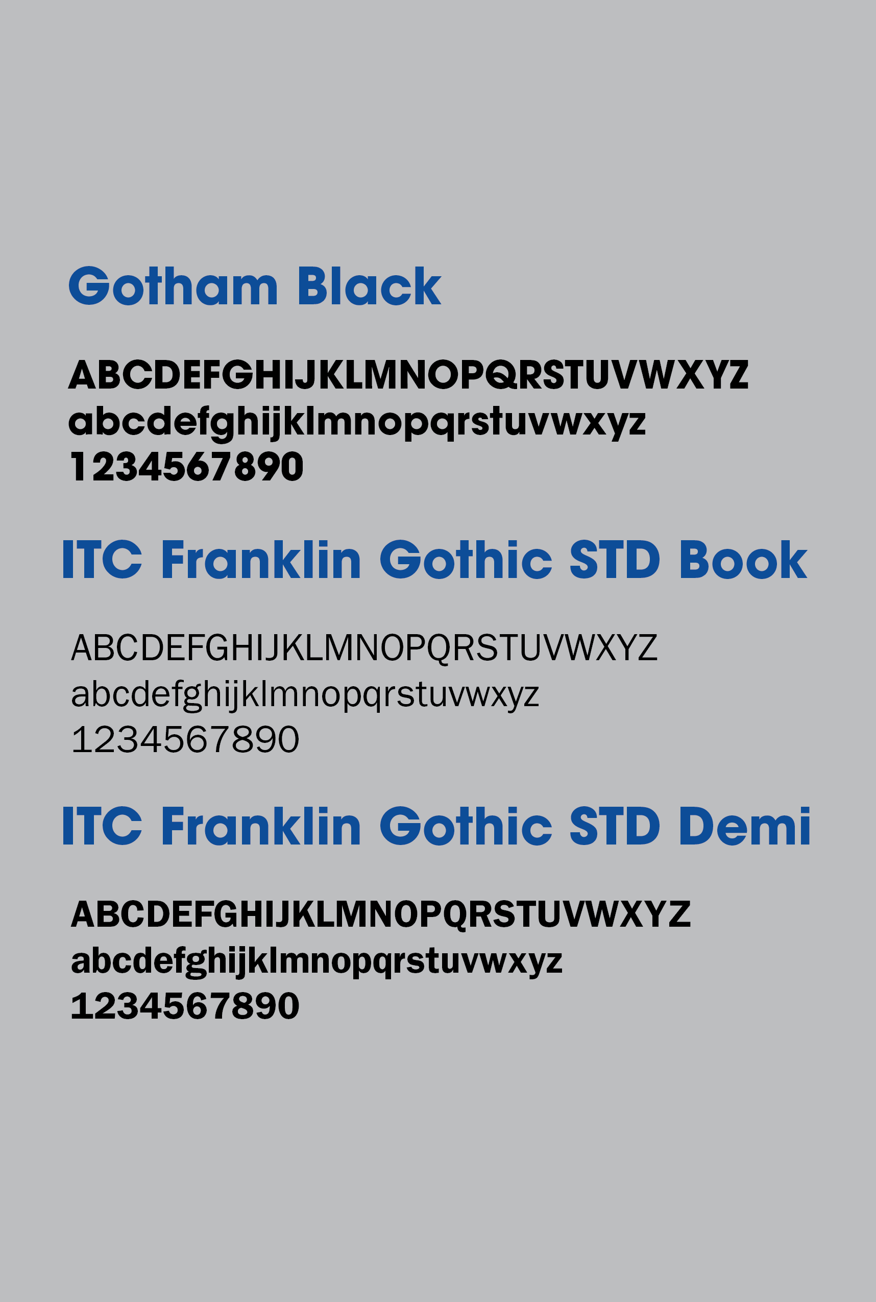
The sample color and sample typefaces come from the SMC Brand Style and Logo Guidelines page of the SMC website.

Sample Typefaces:
My Role in the Project
Graphic Designer: I conducted design research and created posters informing students about the Fuel for Finals Week event.
Who was the client, what was the brief?
Client:
Santa Monica College. (Academic Project)
Brief:
Create deliverables that spread awareness of the Fuel for Finals Week event to any students who could benefit from the event.
Project Overview
Problem, Insight, Solution
Problem:
-Not many students knew of the Fuel for Finals Week event, from which they could potentially benefit.
Insight:
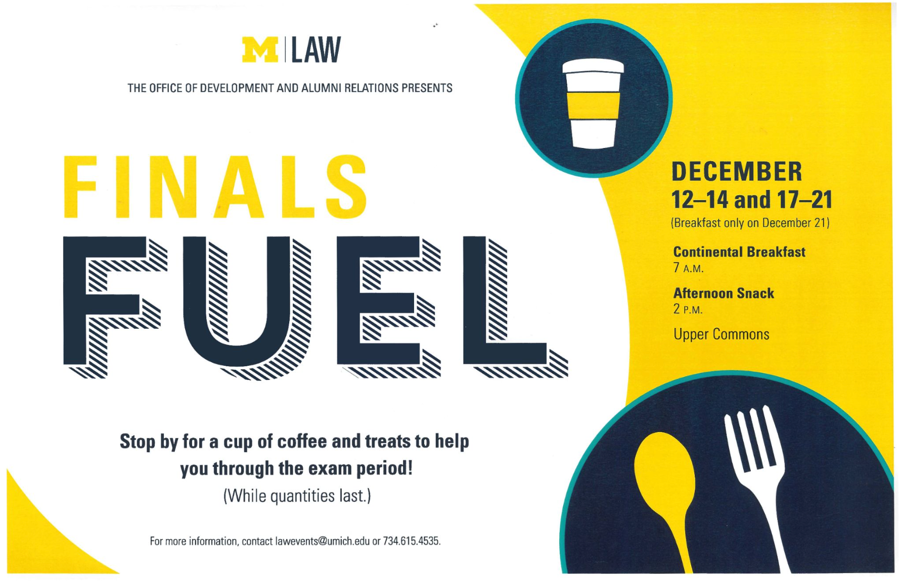
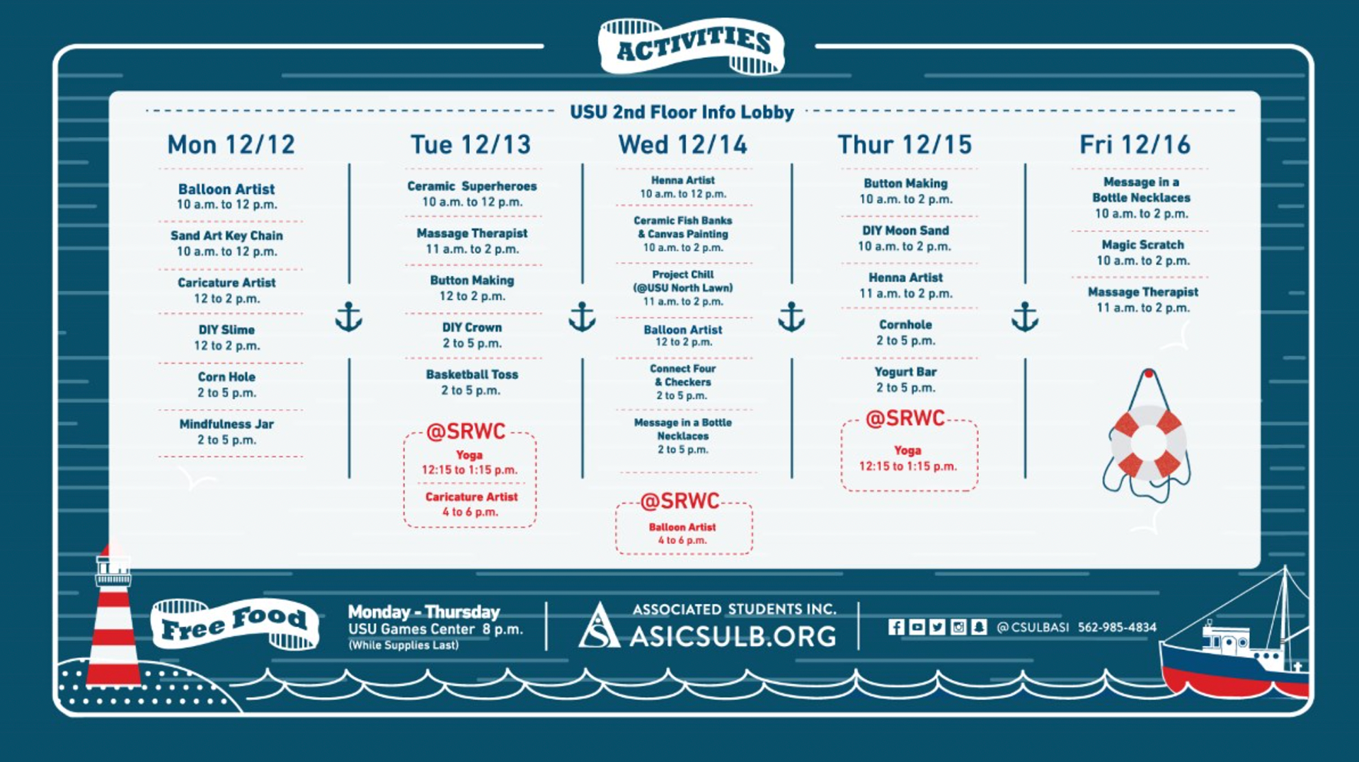
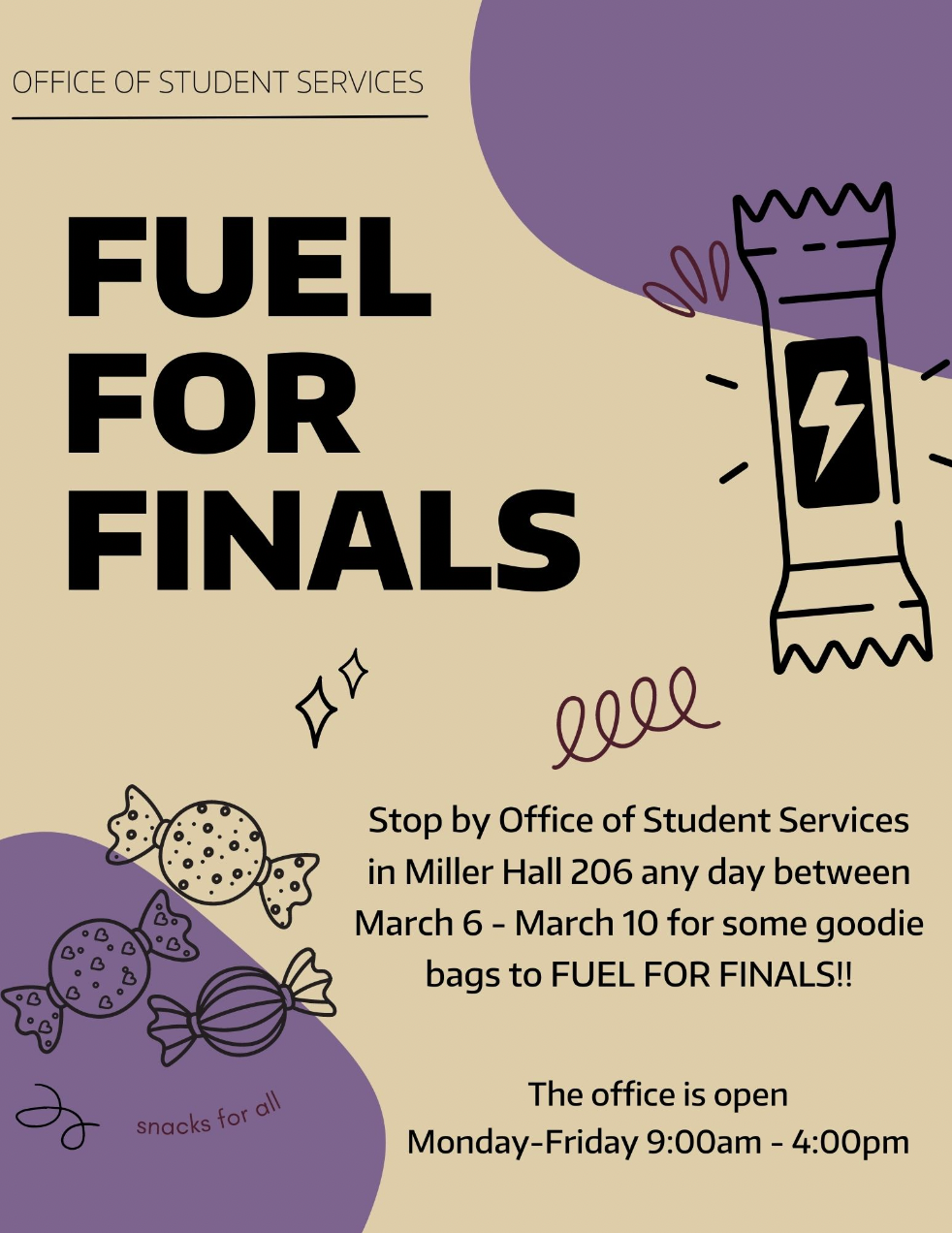
-An insight I gained from my research was that numerous other colleges had Fuel for Finals Week programs and designed posters advertising them, which they displayed on campus.
Solution:
-I found examples of posters from different colleges and used them as inspiration for a poster that I would make according to SMC's style guide.
Process
I searched for inspiration, created several low-fidelity sketches on paper, created a high-fidelity sketch on Adobe Illustrator, consulted with the professor, and used her feedback to create the final design.
Inspiration:
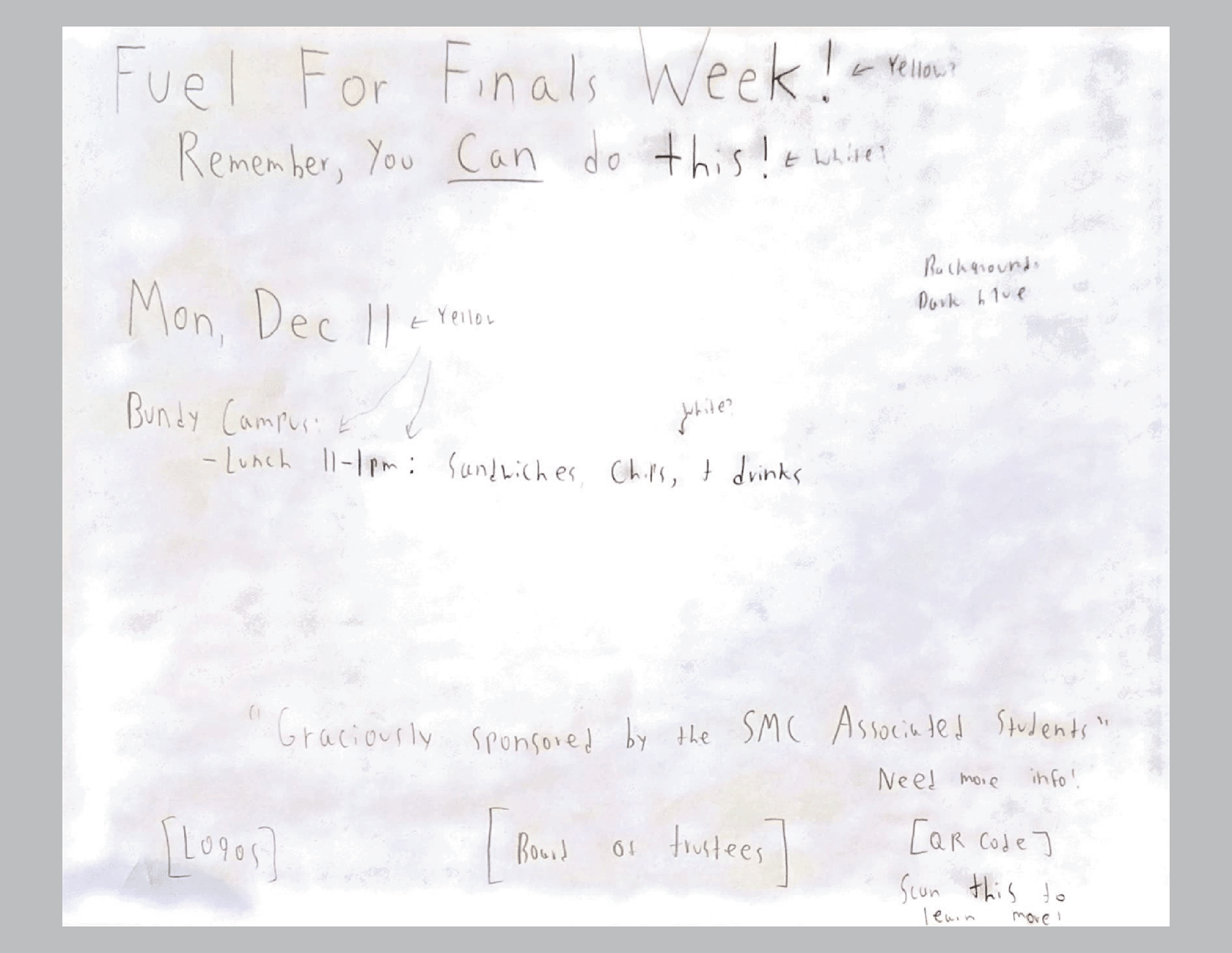
Low-Fidelity Sketches:

High-Fidelity Poster Iterations:
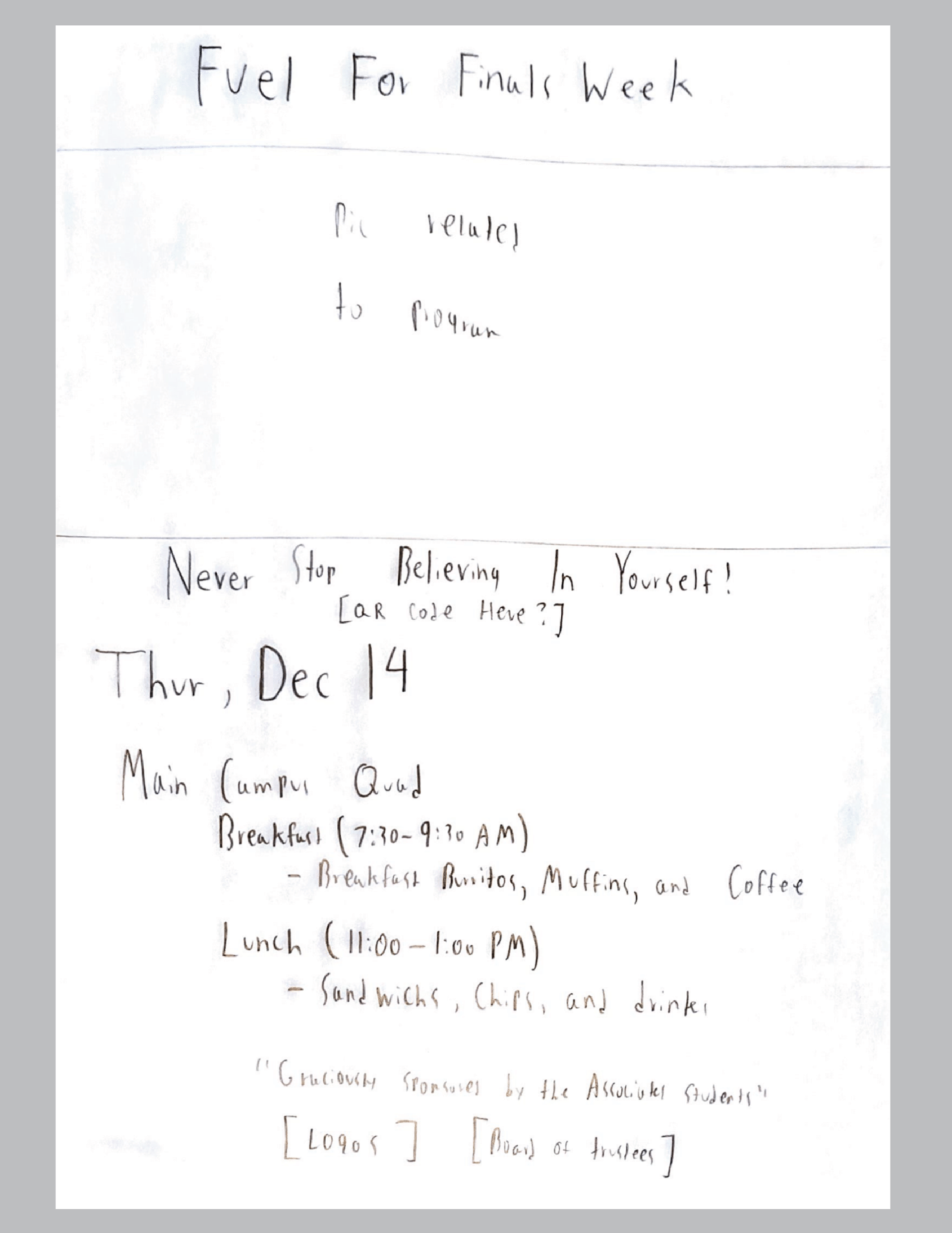
Iteration 1:
Initial Poster Design

Initial Poster Design
Iteration 2:
Changes:
• Left-aligned the text.
• This made the information seem less crowded and more organized.

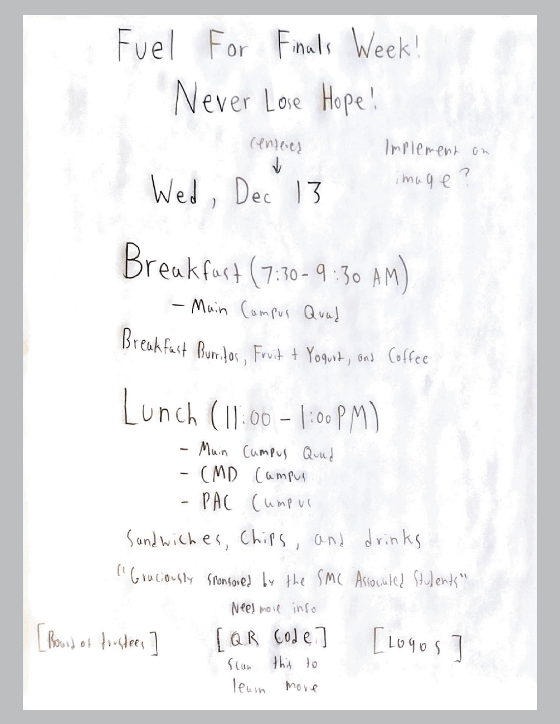
Iteration 3:
Changes:
• I made the logos and the staff information at the bottom larger for increased visibility.
• I also bolded the text for each meal time, since this was some of the most important information.
Iteration 4:
Changes:
• Removed the unnecessary quotation marks around "Graciously sponsored by the SMC Associated Students."
• Made even spaces between the Board of Trustees, the QR Code, and the logos at the bottom, to make the bottom of the poster more harmonious and easier to read.
Iteration 5:
Changes:
•Made “Free Food for SMC Students” slightly larger.
•Aligned the detail text with the left side of the date text.
•Increased the size of the date and detail text, so it would be easier to read.

Iteration 6:
Changes:
• Increased the space between the dashes and the menu items.
• I hoped this would make the text less crowded.

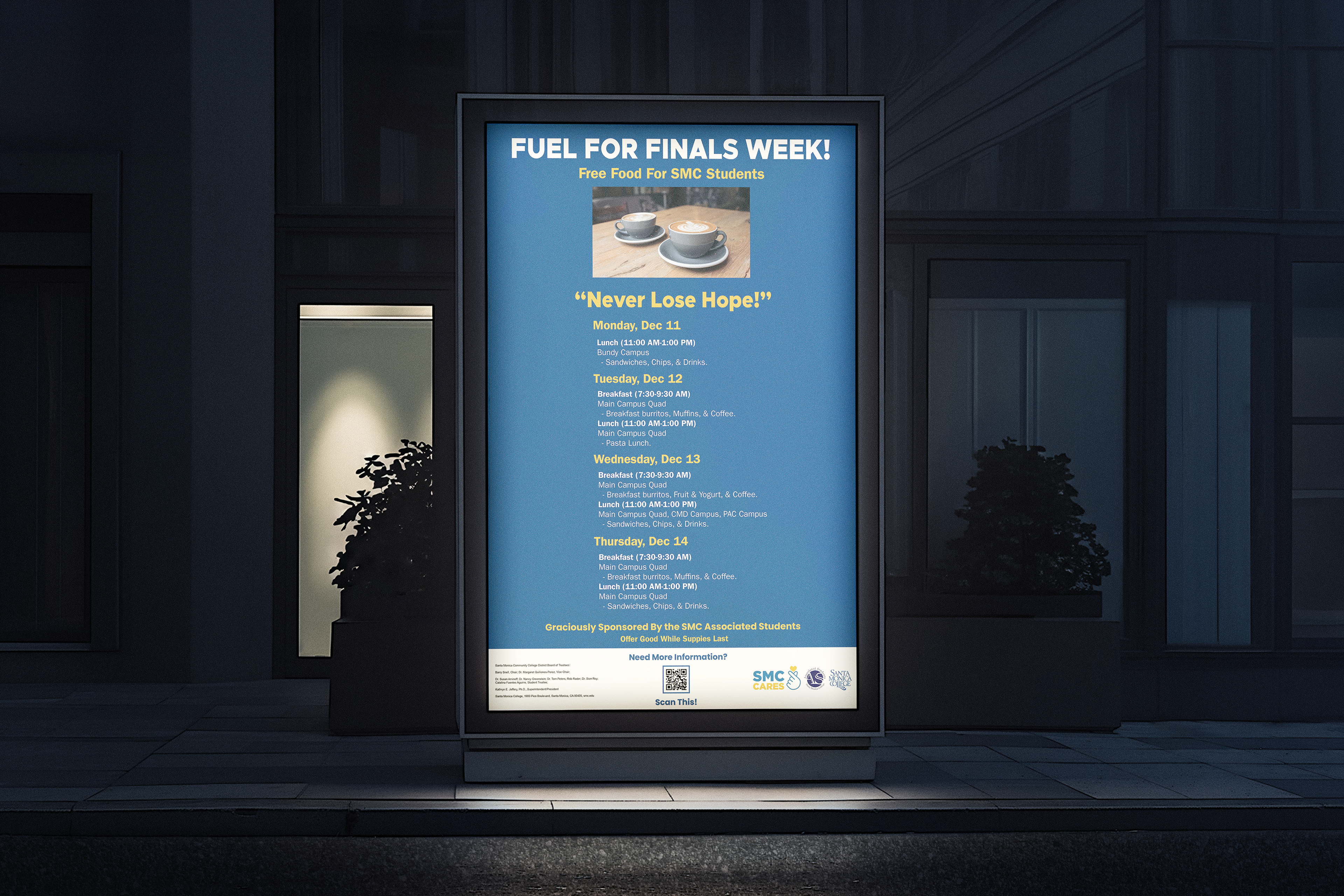
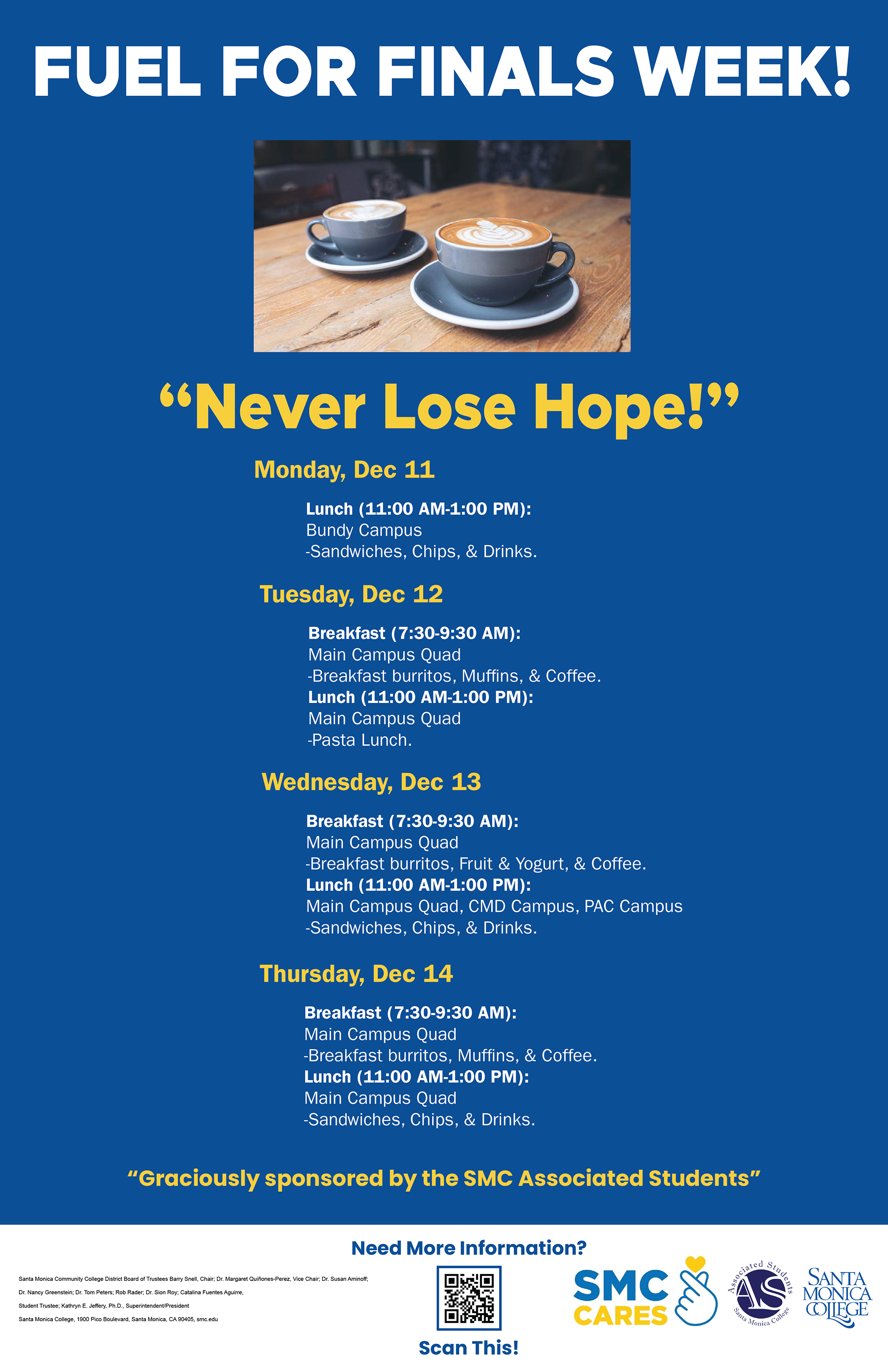
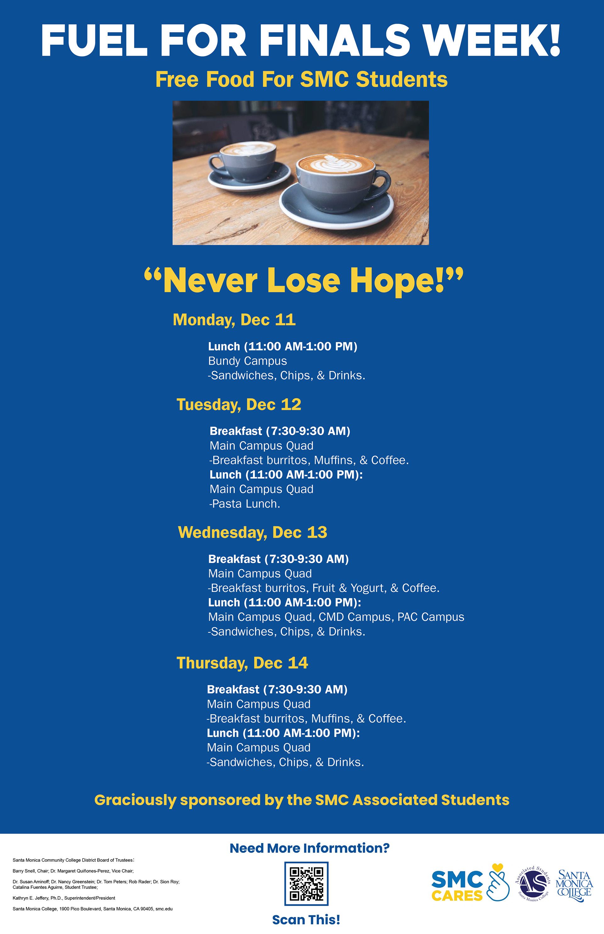
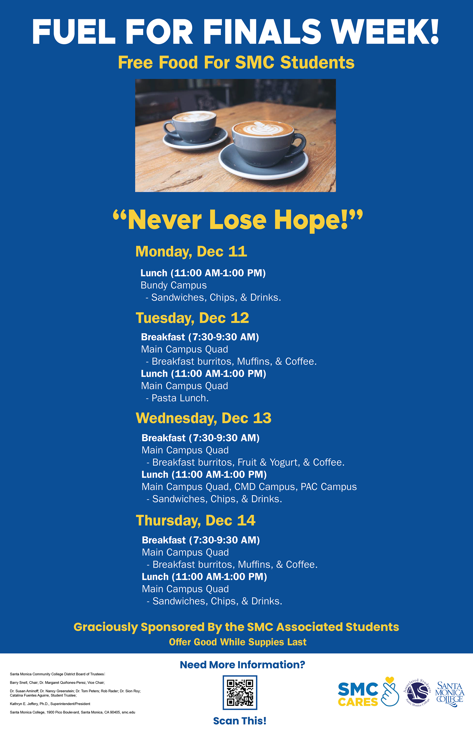
Final Iteration:
This is the final poster design.
Changes:
• Added a disclaimer that the supplies were limited, to reduce complaints if food or drinks run out.
• I hoped this would motivate viewers to take advantage of the service sooner rather than later.
Results
The final poster I created uses the brand colors of SMC, dark blue and yellow. It contains a picture of coffee cups taken from the SMC website. I felt these coffee cups were an effective image that communicated the event's purpose, so I included them in the poster.
The poster also contains a scannable QR code that takes people to the Fuel for Finals Week page of the SMC website. This provided an easy way to gather more information on the event.
I also decided to prominently display the encouraging message, "Never Lose Hope!" on the poster layout, because I know that finals are very stressful.
I also added disclaimers notifying students these services came in limited supply and that they should take advantage of the opportunity as soon as they can.
Reflection
I consider the project a success because I conveyed the information about the program in a soothing and easy-to-understand way. This is extremely important because finals are a stressful time for students. My poster included calming colors, encouraging messages, and a simple layout to help SMC reduce its students' stress.
Numerous things went well with this assignment:
• I deeply engaged myself in the process of creating the poster designs.
• I had access to the SMC Style guide, which helped guide my design.
• It provided proper colors, typefaces, and other essential features.
• I was able to find poster examples, which provided a framework for my layout.
• I was able to frequently get feedback from the Professor and fellow students to improve my design.
However, there is one major thing I would do to improve this project:
• I would put more effort into contacting the Stakeholder for this project.
• Show her my designs and ask her if they lined up with her goals for the project.
• Ask for her feedback on what she would change to better line up the poster design with the program.
•As this poster was an assignment for my Interactive Advertising class, I thought it best to use my course professor as my primary source of feedback and advice.